
 Enfineitz
Turning a fragmented workflow into a fast, reliable experience
A Personal Drop is a union policy which allows flight attendants to request time off without pay by dropping a scheduled trip.
Project overview
Alaska Airlines needed a safer, more reliable way for flight attendants to submit Personal Drop Requests. The legacy workflow depended on phone calls, emails, text messages and in‑person conversations, which created inconsistent records and exposed the company to union grievances, FAA compliance issues and costly scheduling mistakes. Leadership framed the problem as “make PDR easier,” but early discovery showed the real issue was a fragmented workflow built on a SharePoint system that had been stretched far beyond its intended use.
Because the project was urgent, I used a Lean UX approach focused on rapid interviews and workshops with schedulers and flight attendants. These sessions revealed that the workflow was not just inefficient. It was structurally risky. My role as Lead UX Designer was to redesign the process so both groups could complete the task quickly, confidently and without navigating multiple systems.
Exploration and discovery
Discovery exposed the emotional and operational complexity behind PDRs. Flight attendants often made scheduling decisions around family obligations, especially parents coordinating childcare. Their mental model for a drop request was shaped by personal logistics, not by the structure of the legacy form. They also described uncertainty about whether a request had been approved, sometimes traveling to their base unaware that their schedule had already changed.
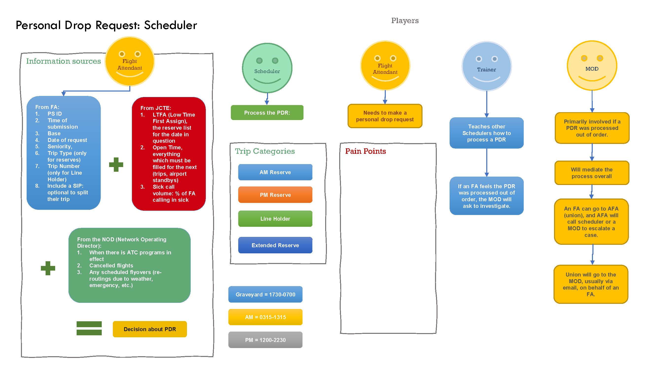
Schedulers faced a different challenge. They had to synthesize information from several systems, each with different levels of reliability. They relied on tribal knowledge to determine which data source to trust, and they frequently entered the same information multiple times. Communication gaps meant approvals were not always relayed back to flight attendants in time.
Both groups used undocumented workarounds to compensate for missing features and unreliable data. These shadow workflows revealed where the system was failing and where the redesign could add value beyond the original product hypothesis.
UX design process
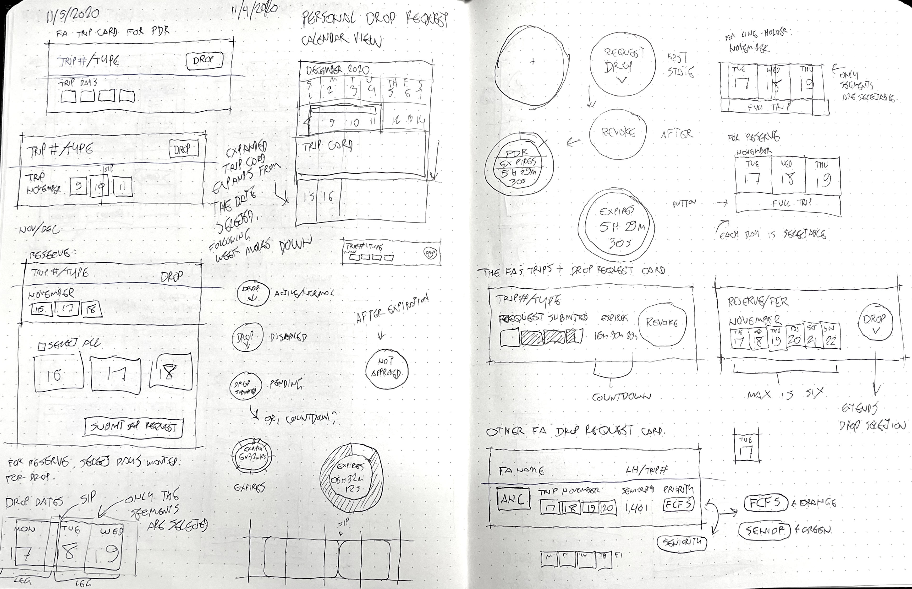
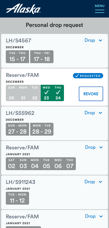
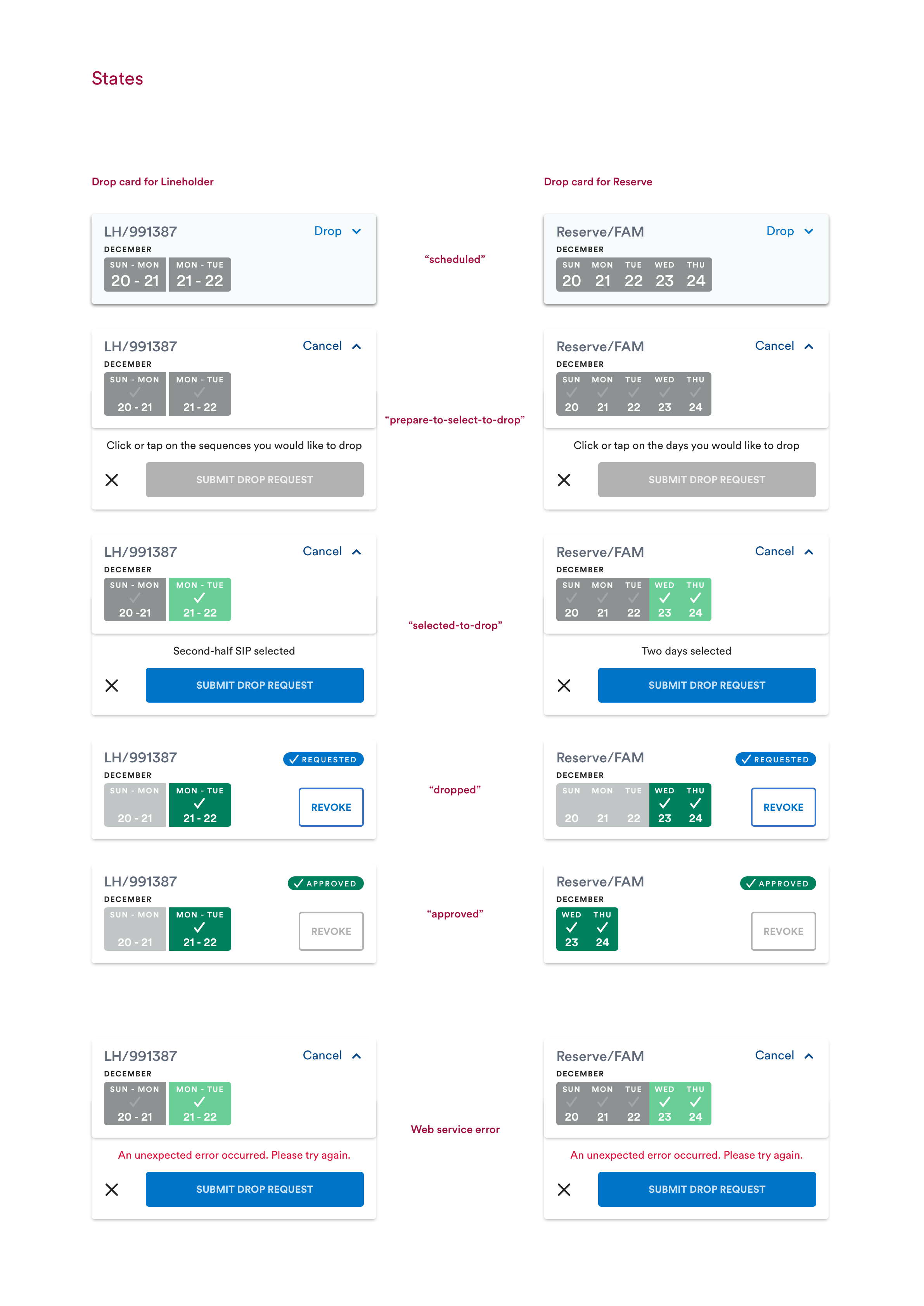
The design centered on two scheduling models: reserve blocks and line‑holder trips. Each required a different way of representing time and selecting segments. The existing date picker could not support either model without forcing users to enter data the system already knew. I designed a custom selector that visually represented trips and segments, informed directly by user interviews.
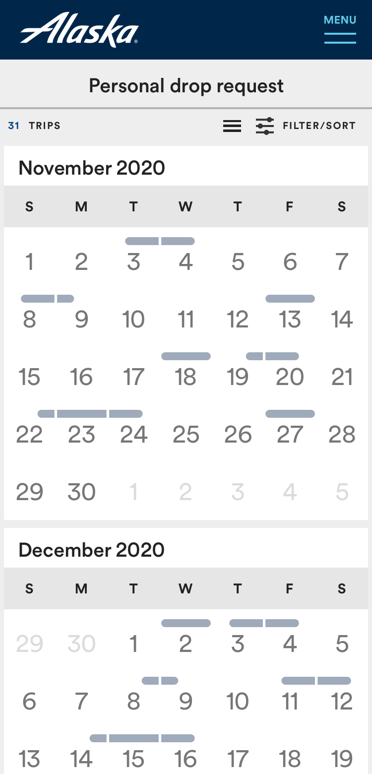
I created new UI patterns that worked across mobile and desktop. Flight attendants needed a fast, gesture‑friendly mobile experience, while schedulers needed dense, reliable data on a desktop. Components were designed to scale across breakpoints without losing clarity.
Validation happened through iterative reviews with the product team, UX peers and engineering. We collaborated closely to remove redundant steps and automatically retrieve data from multiple systems so schedulers no longer needed to authenticate into separate applications.
A major tradeoff involved a feature that allowed flight attendants to view all PDRs across all bases. I initially believed this visibility might offer value, but usability testing showed low impact and high complexity, so we removed it to keep the workflow focused and intuitive.
Final design
The final design eliminated most manual data entry and consolidated the entire workflow into a single, intuitive experience.
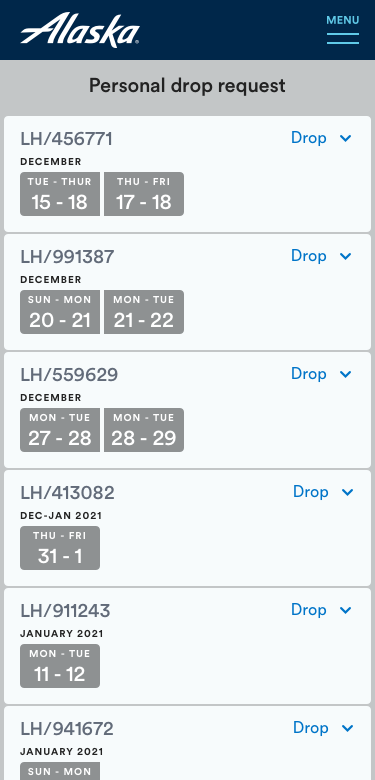
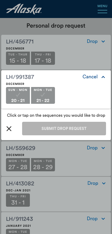
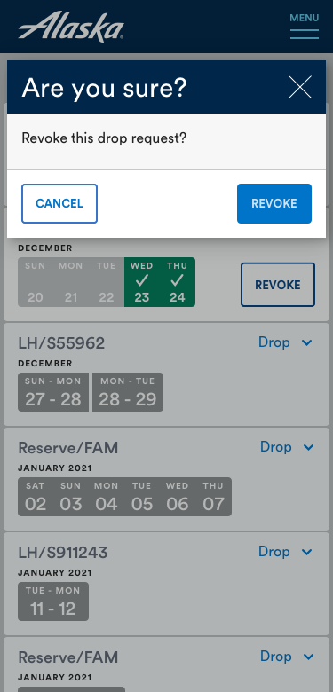
For flight attendants, the interface automatically surfaced all relevant information based on authentication and company ID. They could tap, swipe and scroll through a visual representation of their upcoming trips instead of typing dates or navigating multiple screens. The workflow fit cleanly on a smartphone and allowed them to revoke a request with one tap.
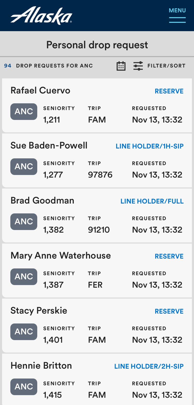
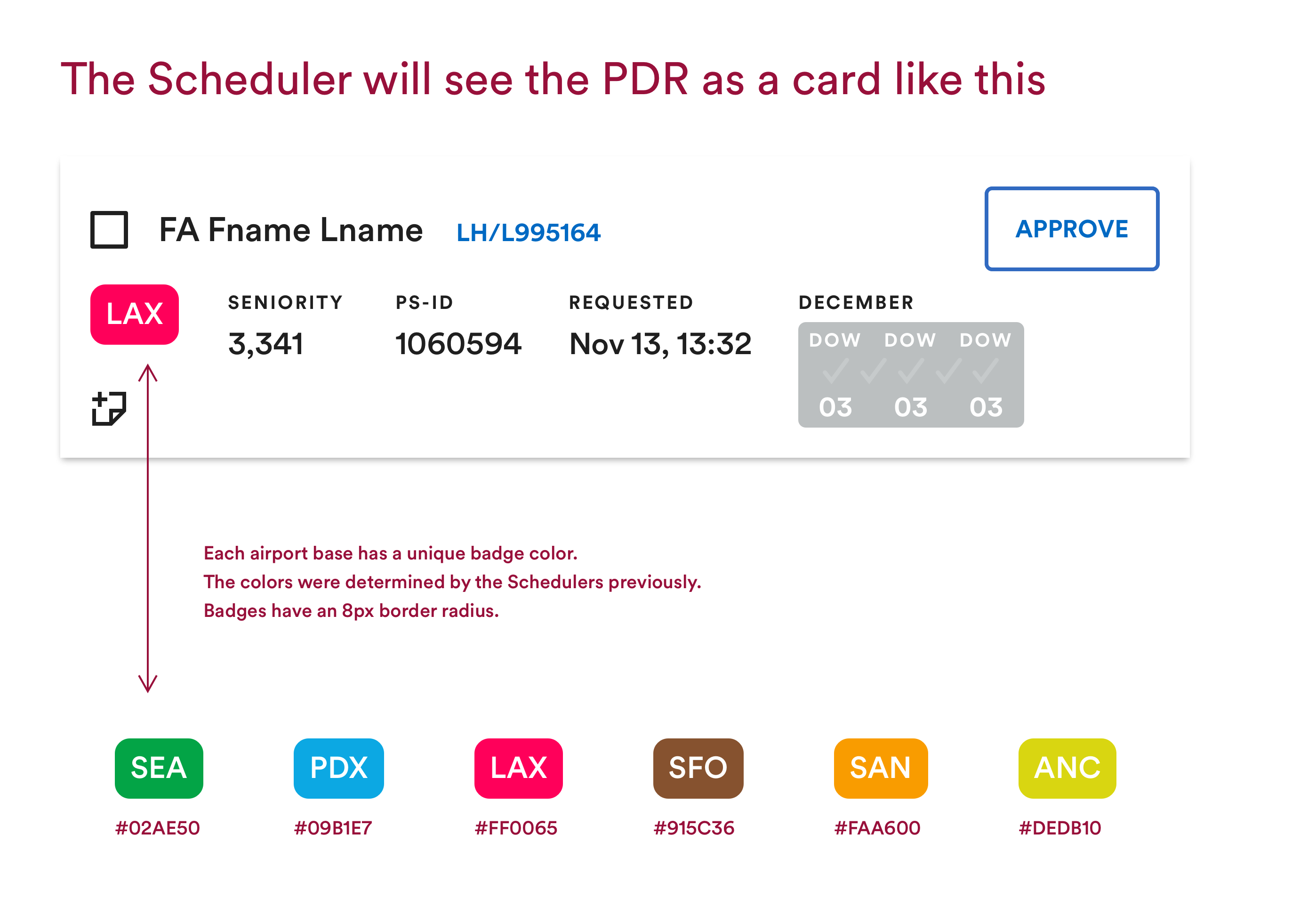
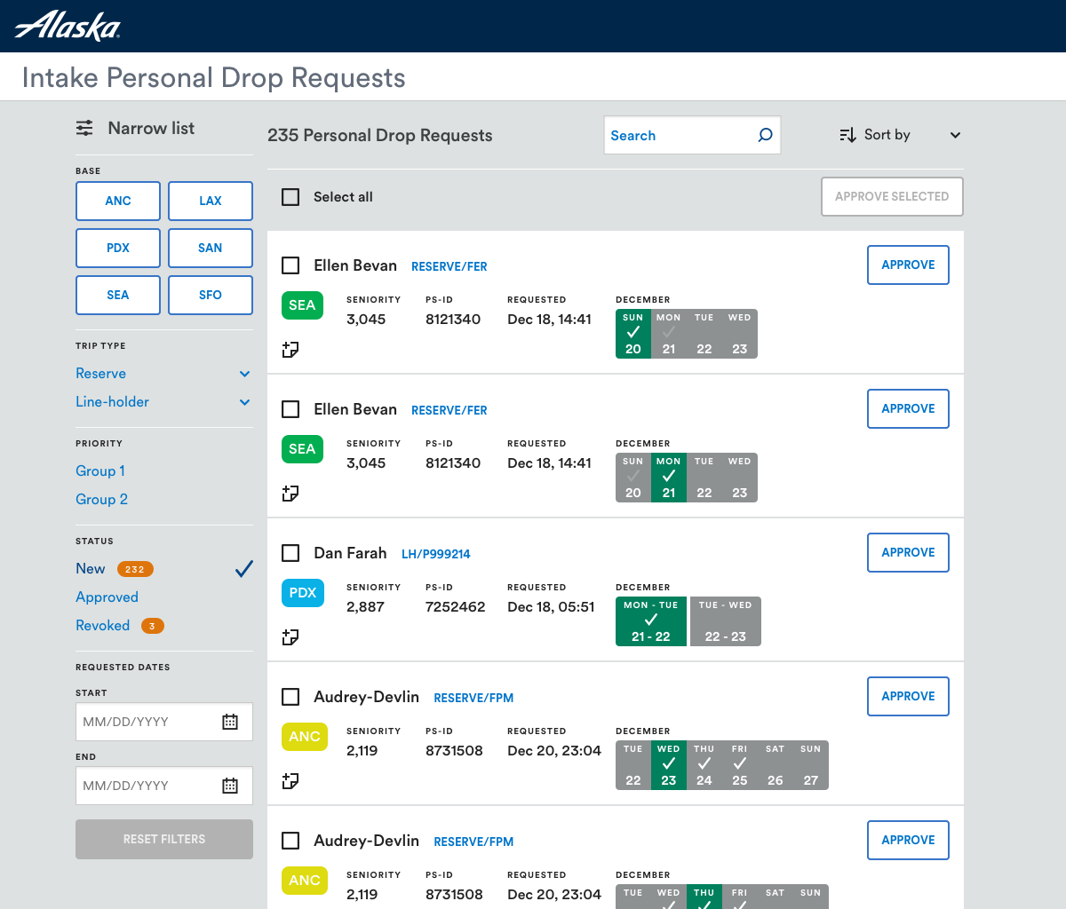
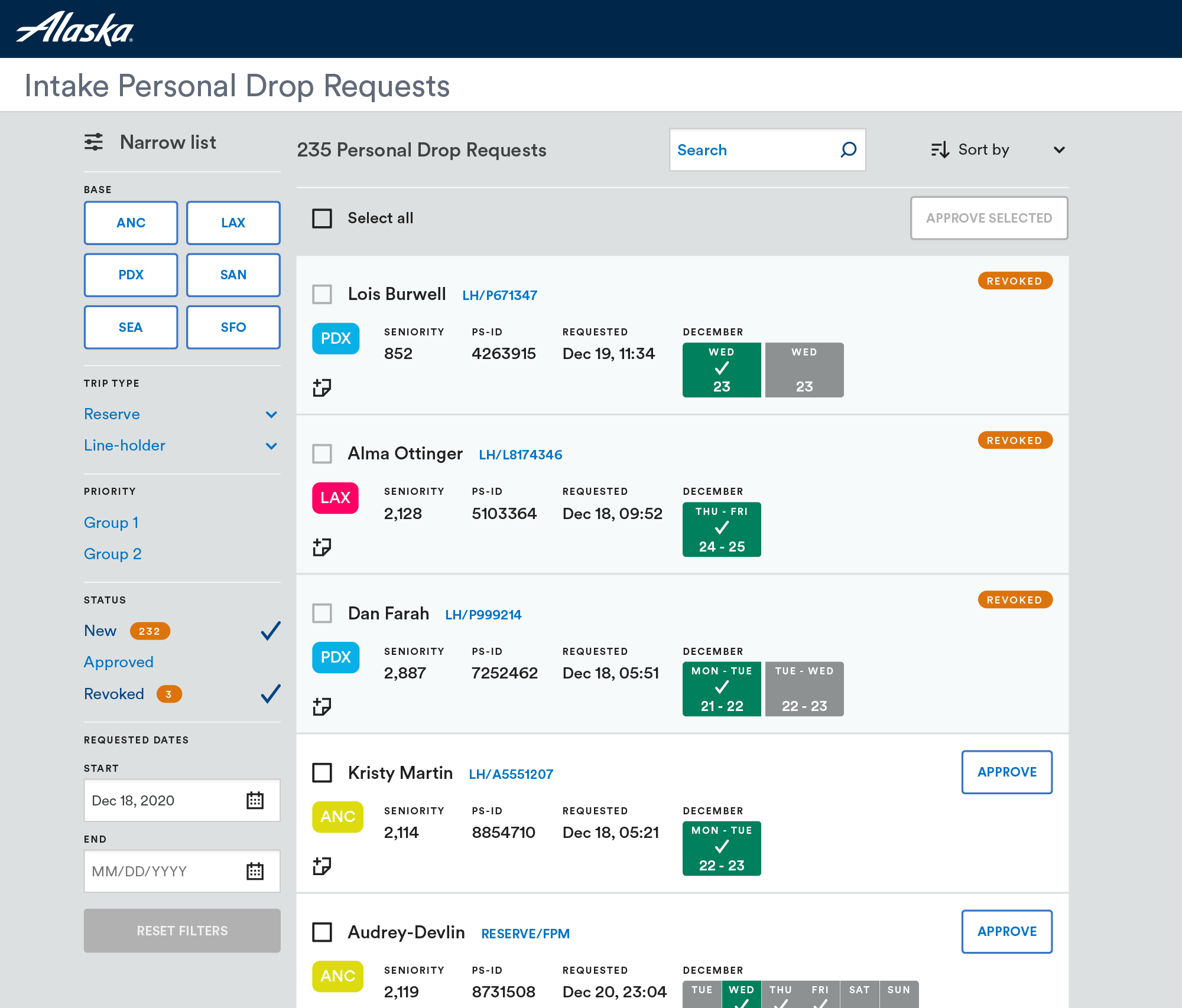
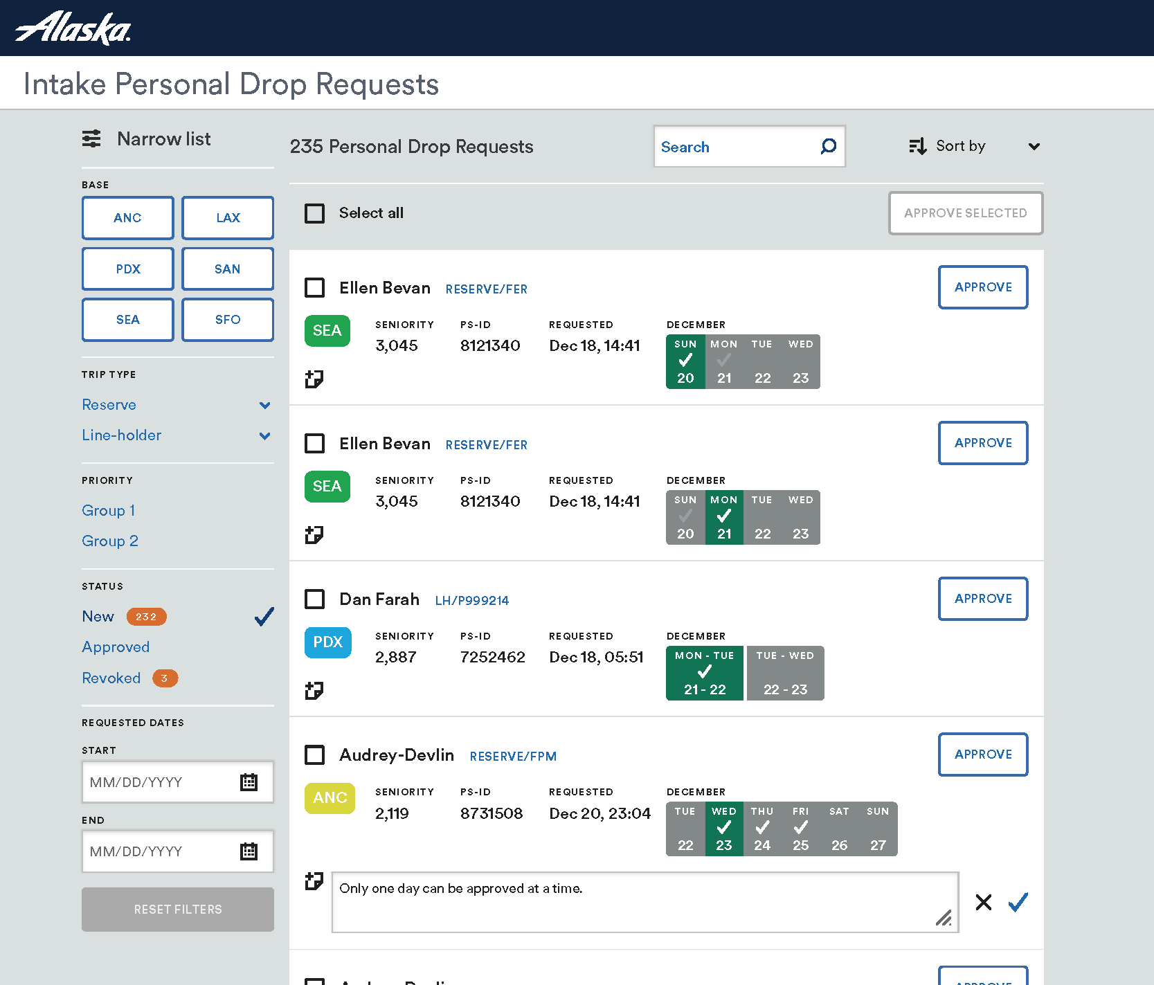
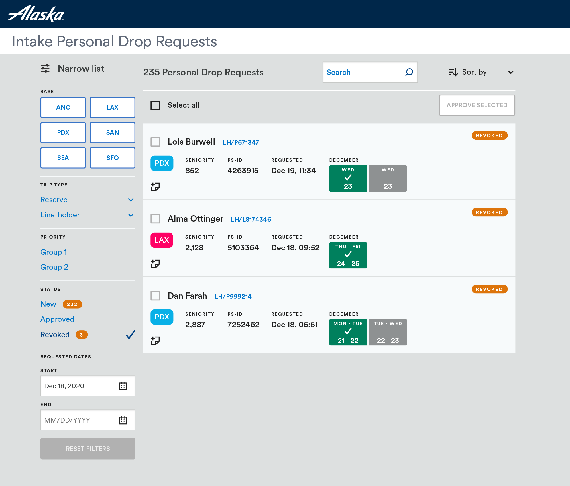
For schedulers, the design unified critical data from multiple systems into one screen. The legacy workflow required opening several applications and scrolling through tables with more than a dozen columns. The new design replaced those tables with responsive cards that displayed all relevant data points at any breakpoint. Several scheduler workarounds were formalized as features, reducing cognitive load and improving reliability.
The scheduler interface became the clearest expression of the redesign. It showed how fragmented data could be unified and how complex decisions could be simplified into a predictable, trustworthy workflow.
Impact
Even without formal post‑launch metrics, the directional improvements were significant.
• Flight attendant PDR time dropped from roughly thirty minutes to under two minutes.
• Scheduler approval time dropped from about fifteen minutes to roughly five.
• Redundant data entry was eliminated.
• Multi‑app cross‑referencing was replaced with automatic data retrieval.
• Operational risk decreased because the workflow no longer relied on inconsistent communication channels.
The new patterns contributed to a broader modernization effort within the scheduler and flight ops design system, creating reusable structures for future applications.
Lessons learned
Union‑regulated workflows require union voices in discovery. Their policies shape how flight attendants make decisions, and including union leaders earlier would have surfaced constraints sooner.
Designing for two user groups with conflicting needs works best when discovery and testing are separated. Flight attendants needed a fast mobile experience, while schedulers needed dense desktop clarity. Treating them as distinct tracks helped the final product act as a mediator between their mental models.
Working with SharePoint reinforced how legacy systems can quietly create operational risk. As workflows scale, older tools often become bottlenecks that encourage hacks and redundant steps.
If I were to redo the project today, I would expand the research pool, explore more solution concepts and use an impact‑effort matrix to prioritize features more strategically. Earlier alignment with engineering and union stakeholders would also create more space for innovation.