
 Enfineitz
Formerly known as Mission Accelerator Search
A tool for maintenance planners of military aircraft to search maintenance records on specific aircraft in one place.
Project overview
NGPS Search is an internal tool for military aircraft maintenance planners to search.
It was an existing application that had been serving various Boeing defense customers for years.
My role was as UX designer, to improve the design and usability by about 70%.
I used Figma for design, and Figjam for research and ideation.
The team consisted of a Lead UX designer, two Product Owners, two or three Subject Matter Experts (SMEs), and four developers.
The project was planned for two product increments, approximately two fiscal quarters.
The process of a design update started with extensive interviews with a couple of SMEs, to become familiar with the tool, the personas, and what type of data they would use it for.
The primary problem statement was that what analytics had been studied revealed that usage was much lower than hoped, and stakeholders sought to increase usage. Overall, the value proposition was for defense customers to improve the mission readiness of their fleet. If a maintenance person was trying to solve a maintenance problem on a specific tail number or model of aircraft, they could find out if other maintenance personnel had encountered the same problem and what they may have done to resolve it.
Stakeholders and SMEs hypothesized that the interface was too confusing, and many of the users would give up before completing their search, finding other, more traditional and less efficient means to research maintenance records.
Exploration and discovery
I started the discovery by writing a value proposition of the product. I validated this in conversations with the product owner and our SMEs.
I then met with our SMEs multiple times to walk through different user scenarios and to identify the pain points.
Because we were dealing with defense customers, our product leadership were hesitant to allow the UX team to conduct user research and field studies with actual users. Our next-best way to get valid data was with direct interviews with SMEs, some of whom had previously been enlisted in military branches and worked as maintenance personnel on aircraft.
To get statistical significance, we met with SMEs who had previous experience and current interaction with all branches of the US military, including the Marines and Navy.
We ran some usability tests to validate the pain points hypothesized by product owners and SMEs.
We found that the biggest issues were with how a query was constructed. Terminology was used in the UI which was unfamiliar to the personas the tool was designed for. A user had to create a query and construct all of the parameters before they could see any results. Most of the SMEs we tested the existing interface with could not even complete the scripted test. Of the few who did, once they arrive at the search results, they did not find what we asked them to find, even though the information was included in the search results.
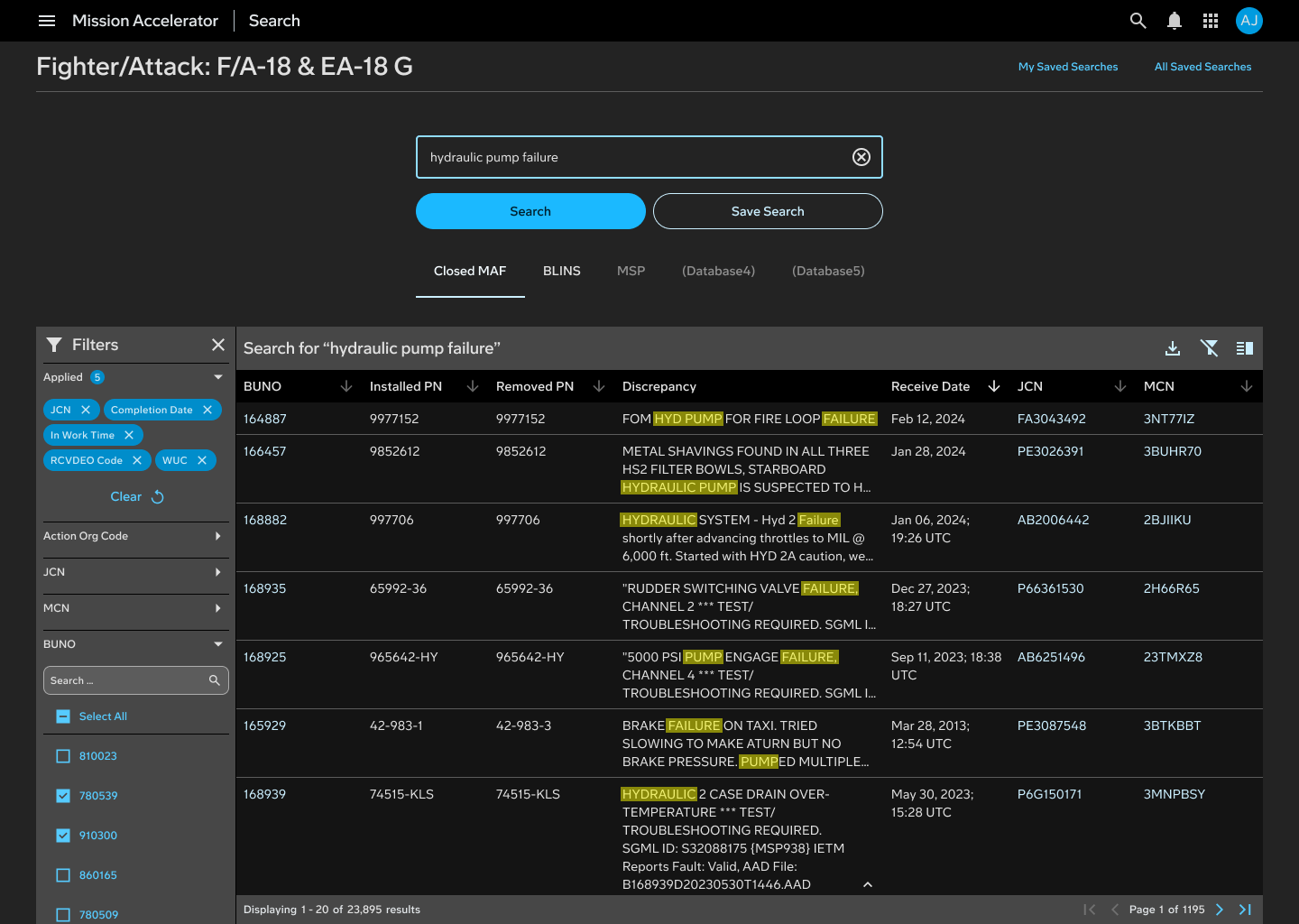
This was because the search results were displayed in a table with at least 27 columns, and, to save space, the developers who had designed the application had restricted row size, and added a scrollbar within cells where there was more data than could fit in the cell.
UX design process
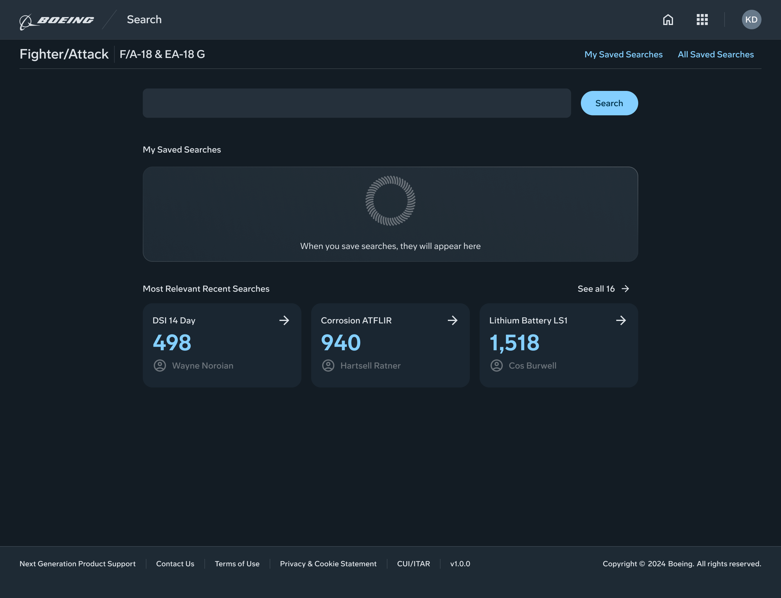
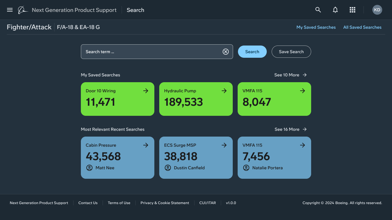
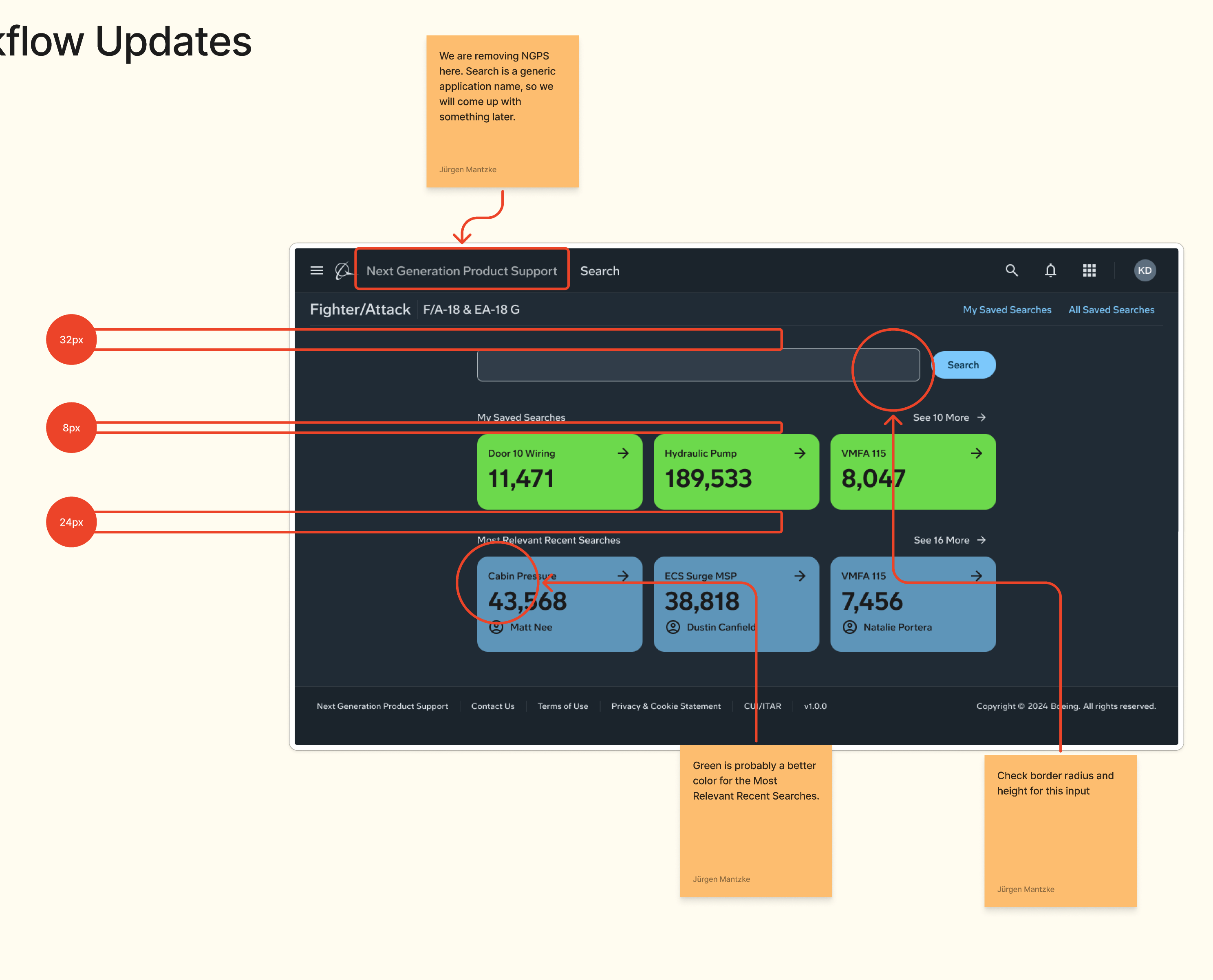
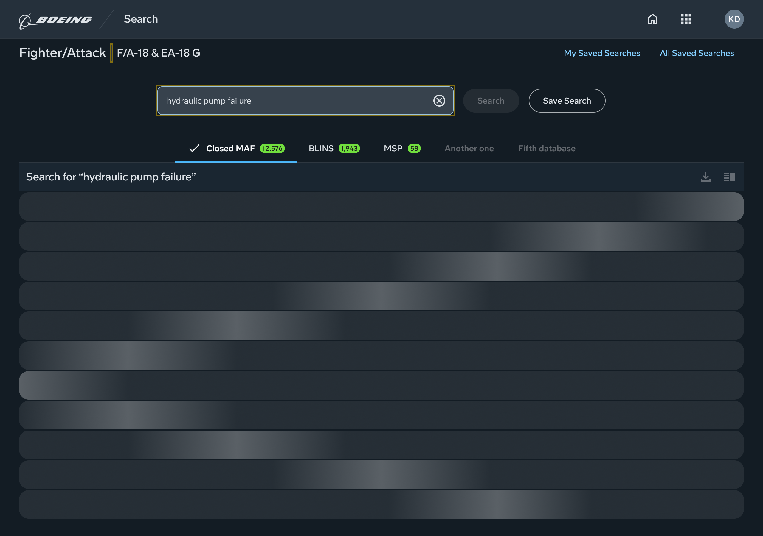
From the research and usability testing, we decided that we needed to get the user to a search field and preview of common searches first.
We presented a large search field, which would give the user quick access to search results.
Part of this would be to display all maintenance records in the selected database, sorted by most recent, by default. Filters would be available from this screen as well.
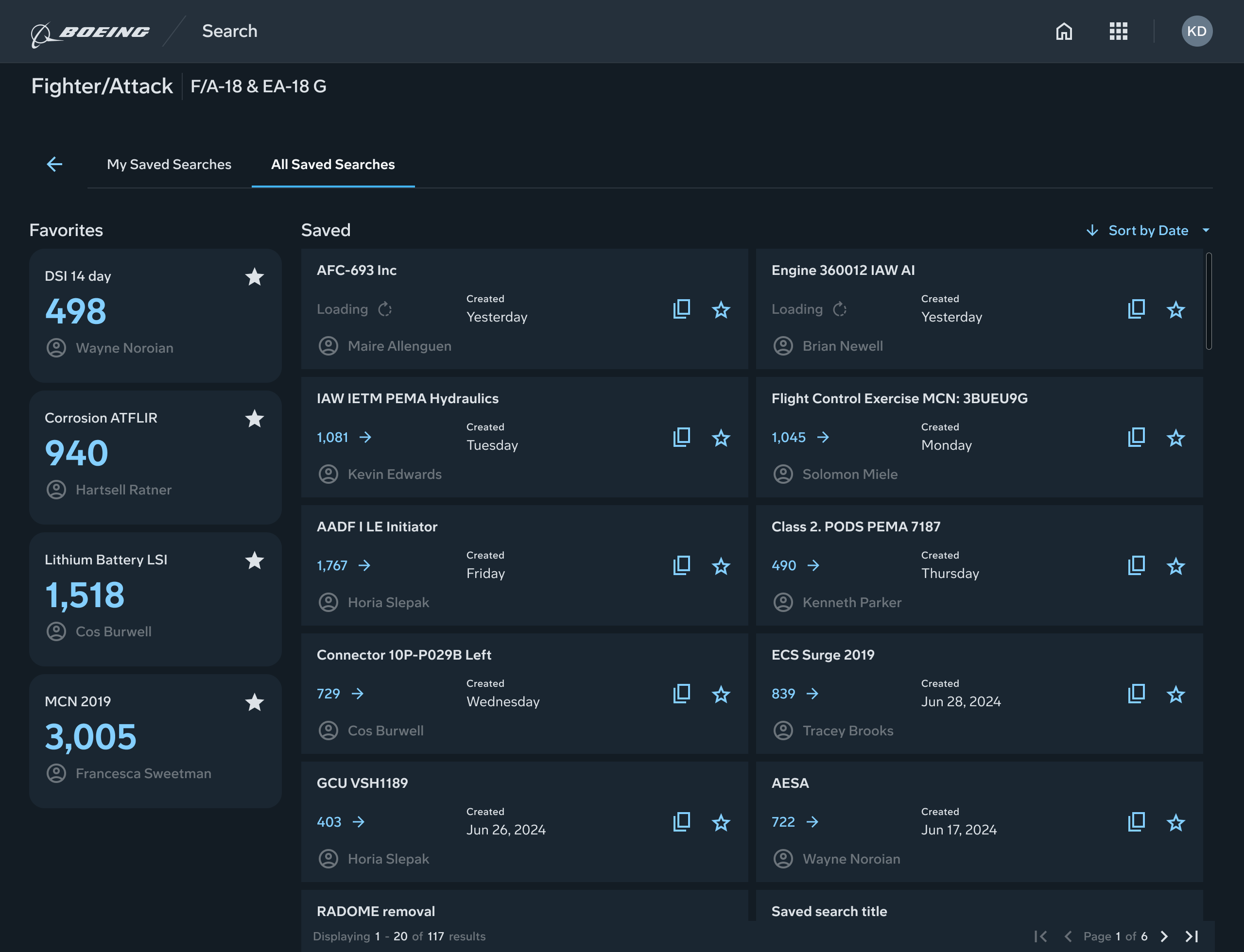
Additionally, to fill up the extra real estate afforded by a single search field, we added cards which displayed common searches, and a space to display their saved searches.
If the user was visiting for the first time, they were given empty state graphics to communicate the affordance of the spaces.
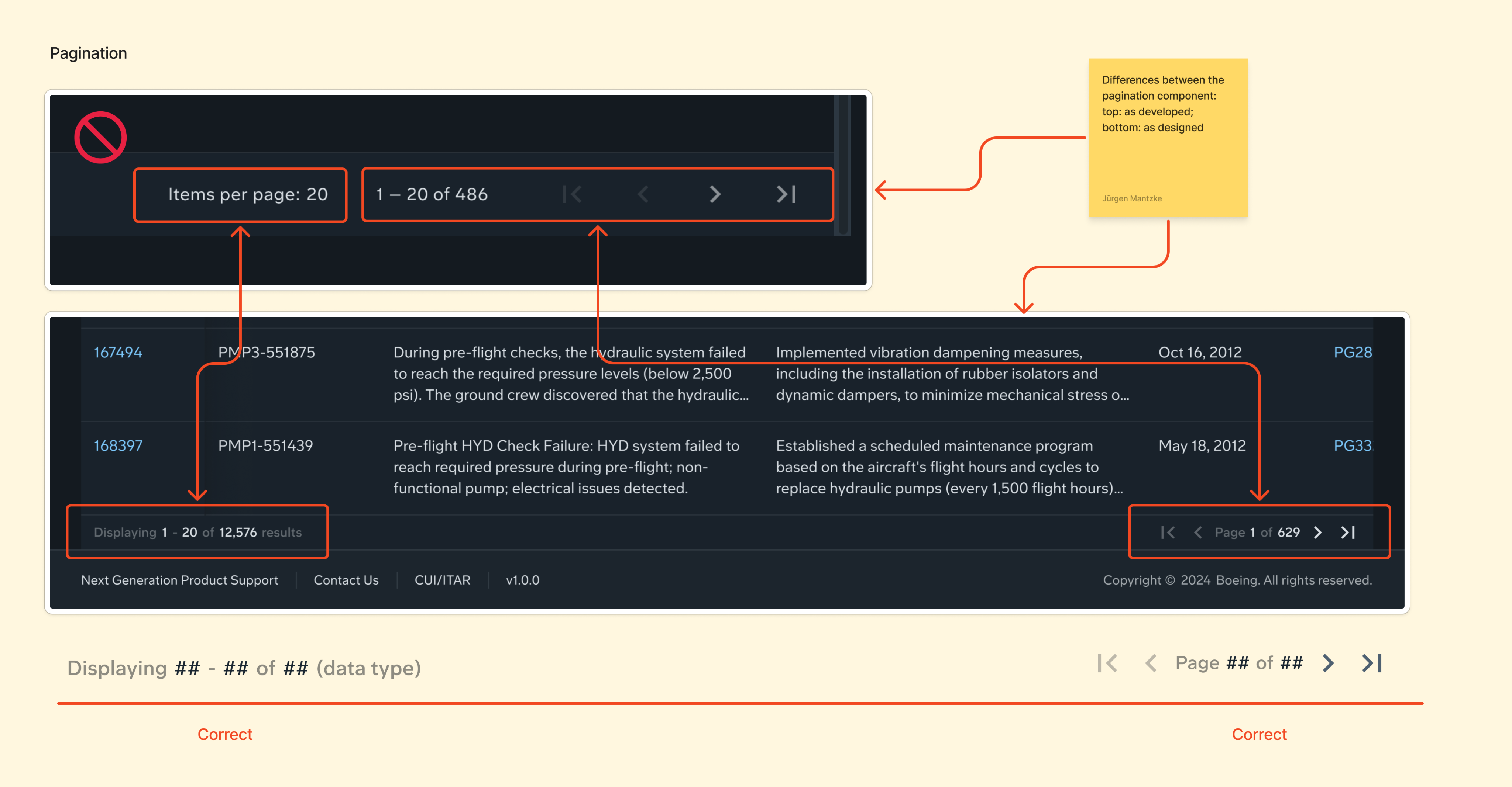
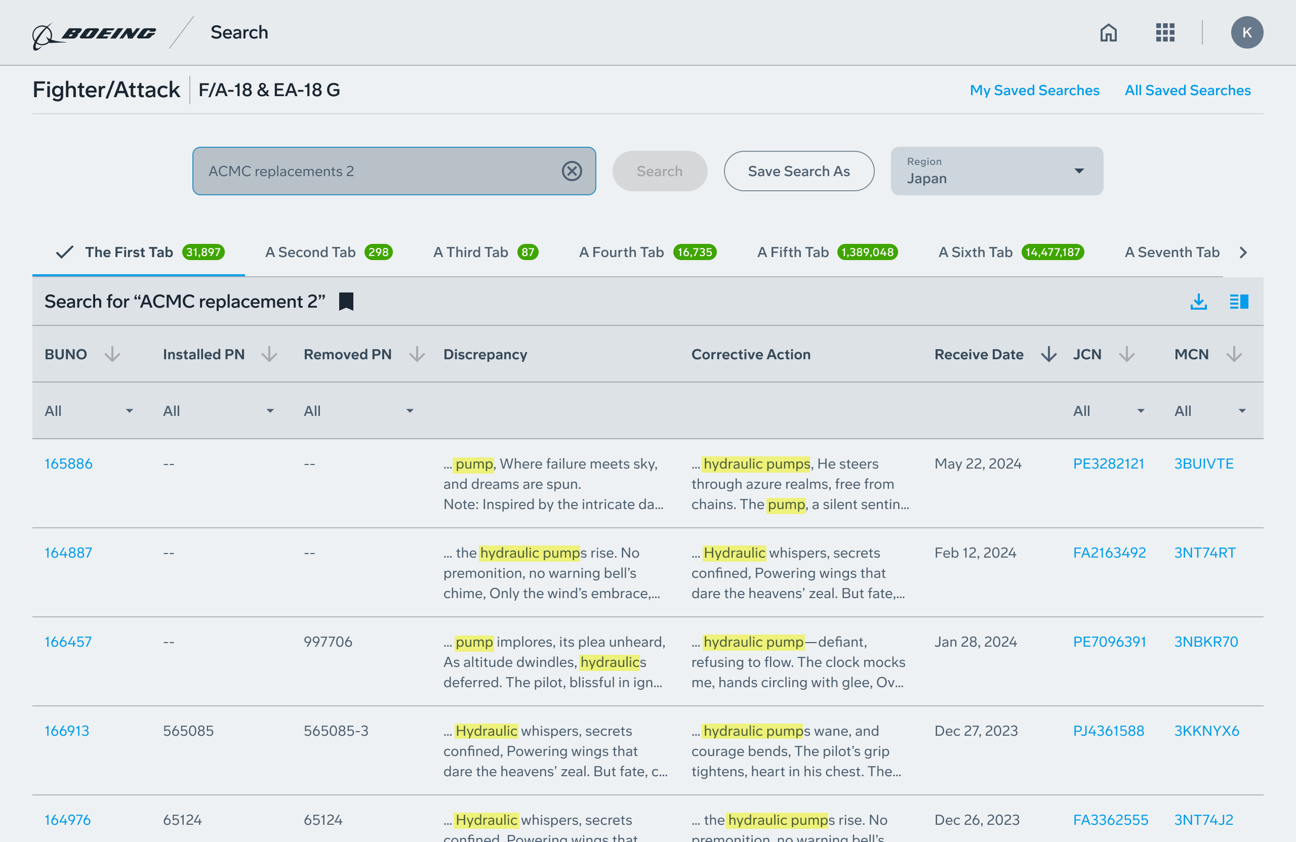
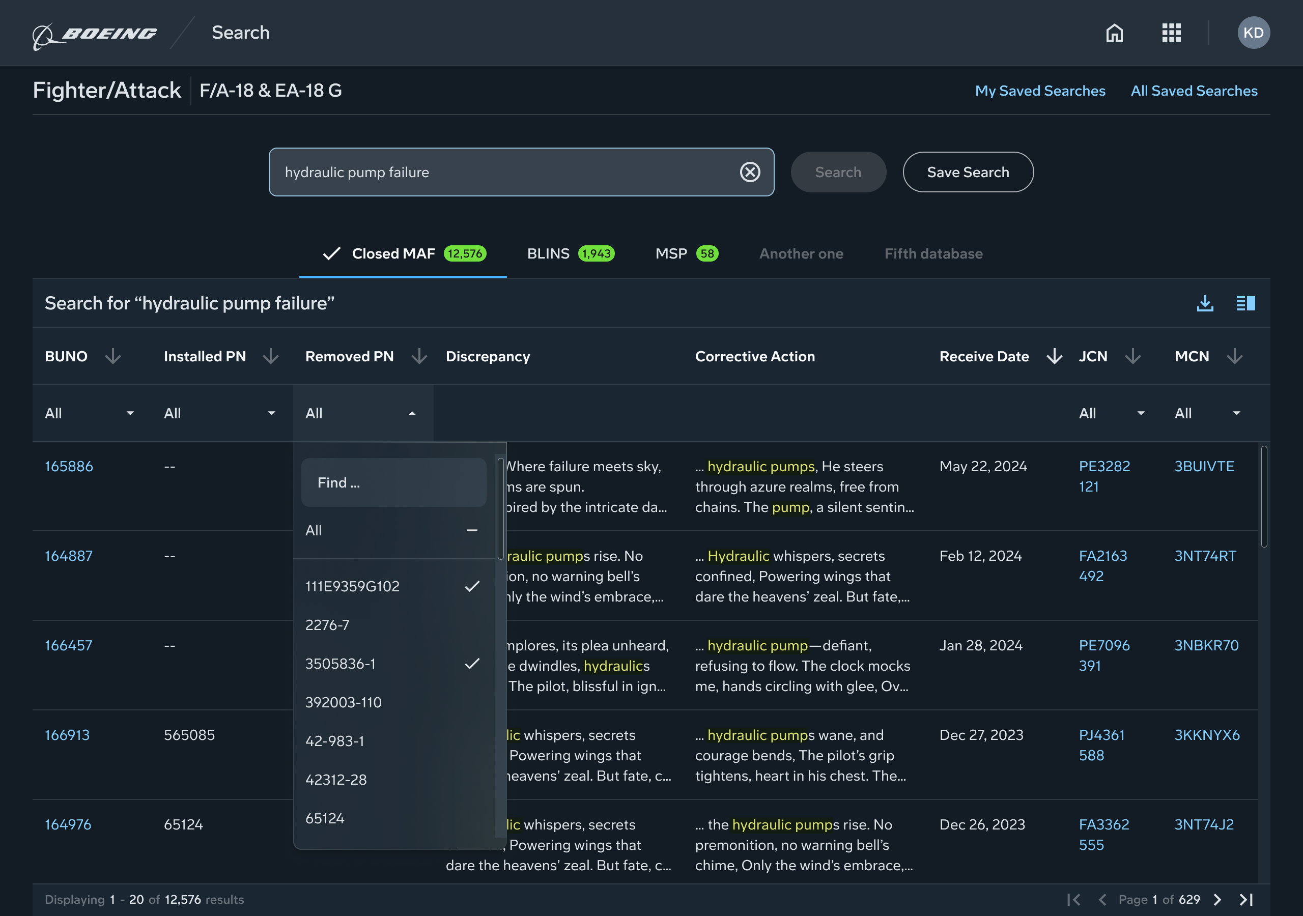
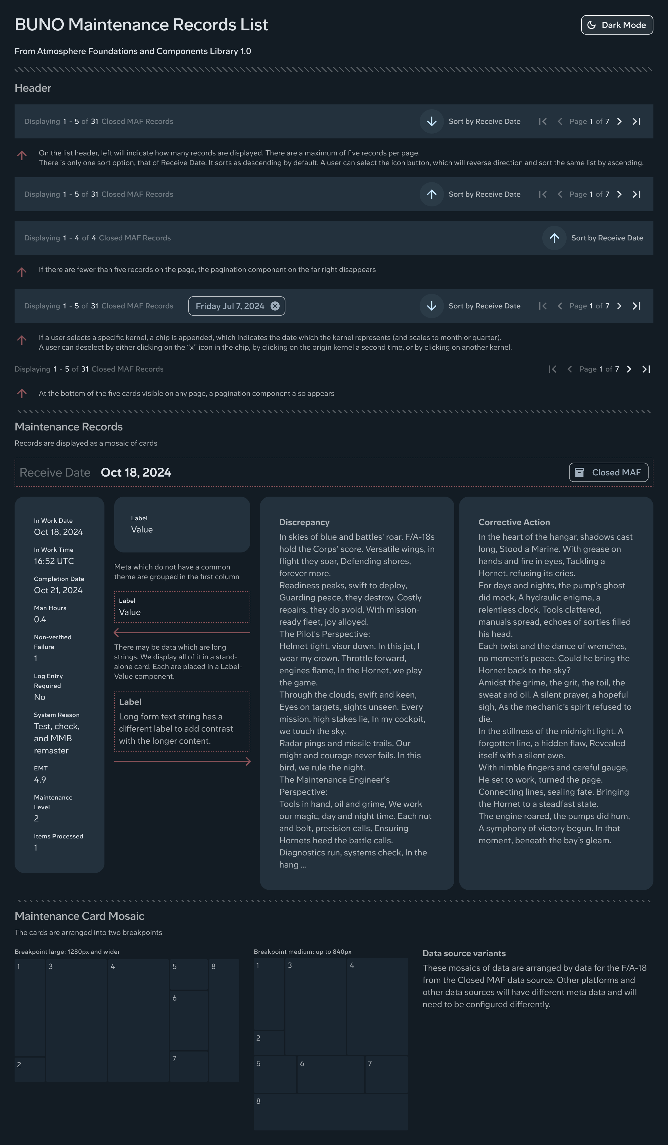
To solve the problem of more columns available than could fit in the most common screen size, we configured the search results to display in an optimized view with six columns. We designed a way for the user to select from any combination of six columns.
Feedback from our primary SME and the PO suggested it would be better to default to six columns, but let the user add all 27 if they wanted, and choose their preference.
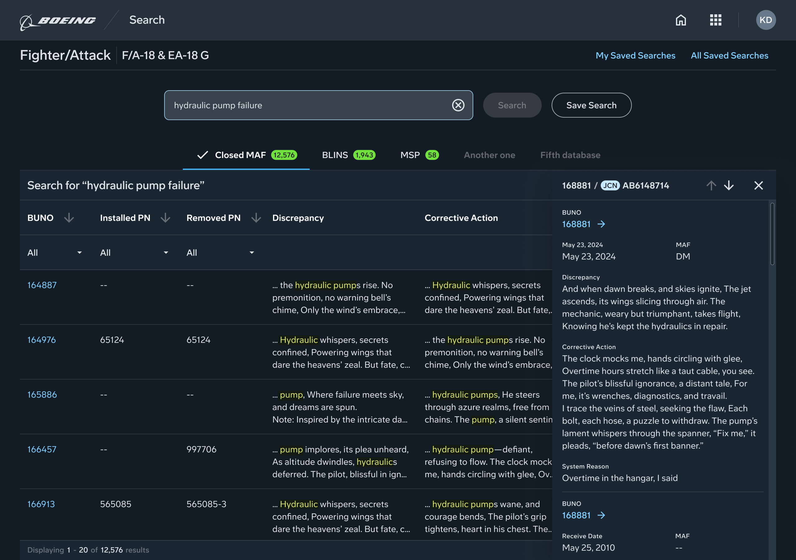
Another issue we designed a solution for was the lengthy text entry in cells of certain columns. The data source were notes and comments from maintenance engineers, and could be rather wordy. This is why the previous full-stack developers had designed them with embedded scrollbars. Our solution was to truncate the visible text in these cells to three lines, but highlight the matches to the search term. We added a reverse truncation, so that the first time the term appeared in a long string would be at the beginning, preceded by an ellipses, if needed.
The only testing and validation possible was from a few SMEs and the PO. However, when running through test cases with these, the feedback was overwhelmingly positive.
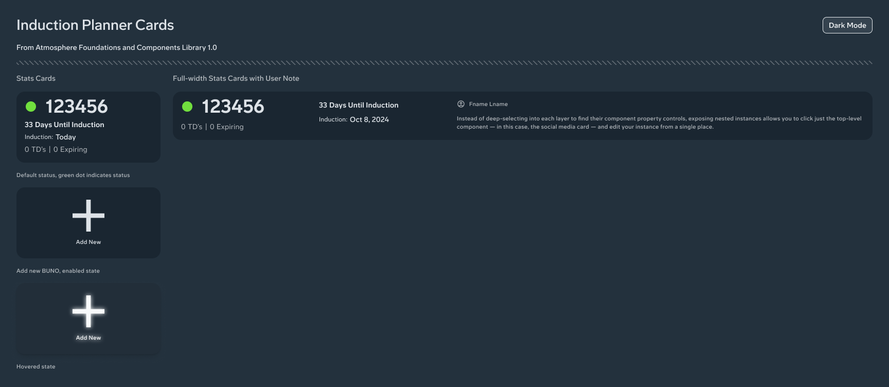
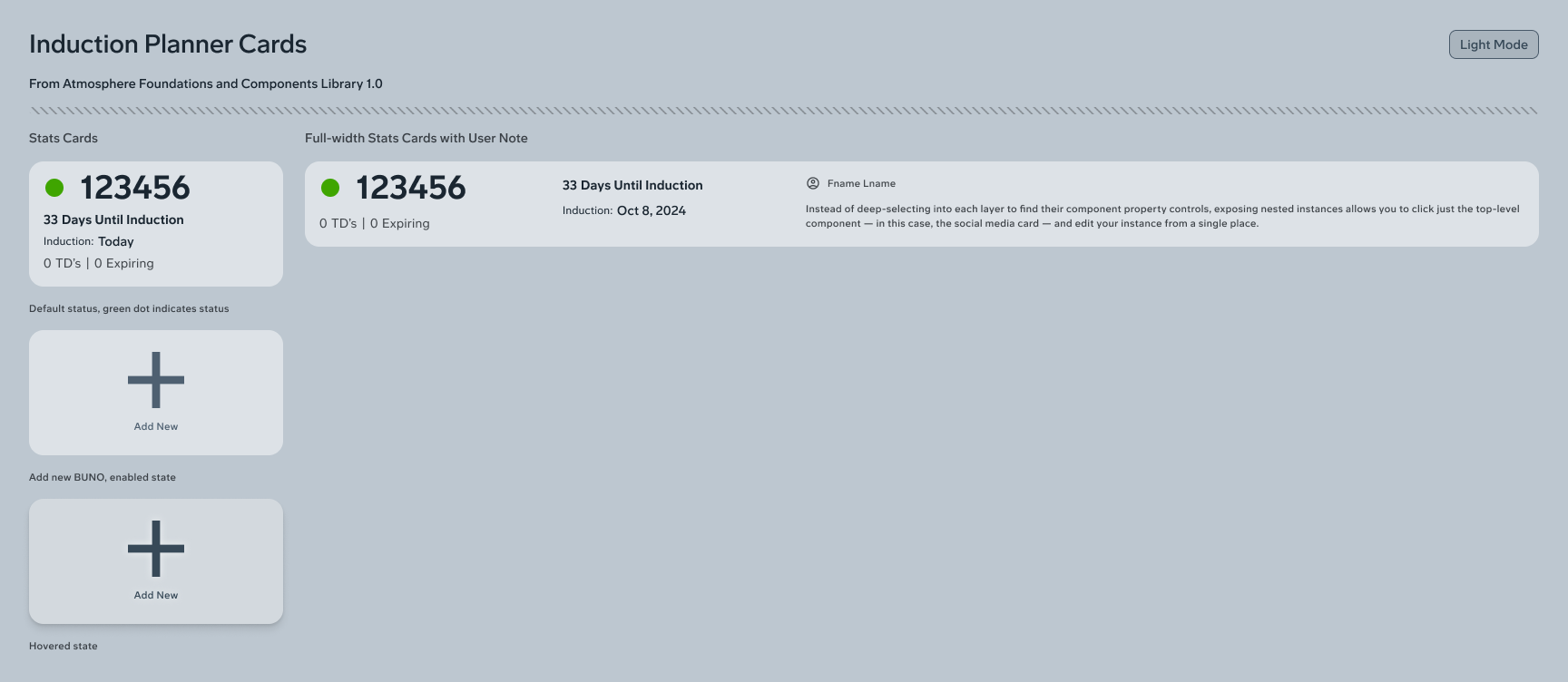
At this time we were beginning to adopt a broader Boeing-proprietary design system, which introduced the ability for the user to switch between dark and light mode.
Final design
The final design was rather simple, since sufficient research about the pain points and KPIs had been done.
New features from Figma, such as auto-layout and swapable slot content components, allowed for more efficient mockups and prototypes.
In earlier wireframes and designs, we were using actual data from the function NGPS Search application. However, because of required security clearance, we were having to verify that anyone with access to the mockups had, at the minimum, a medium security badge. We could not share them with foreign nationals, but many of our engineers and developers were based in other countries.
Wanting to avoid flowing in “lorem ipsum text”, we went to AI to create fictional content to fill in the mockups. This allowed us to stress test and make the design believable. It also solved the access issue.
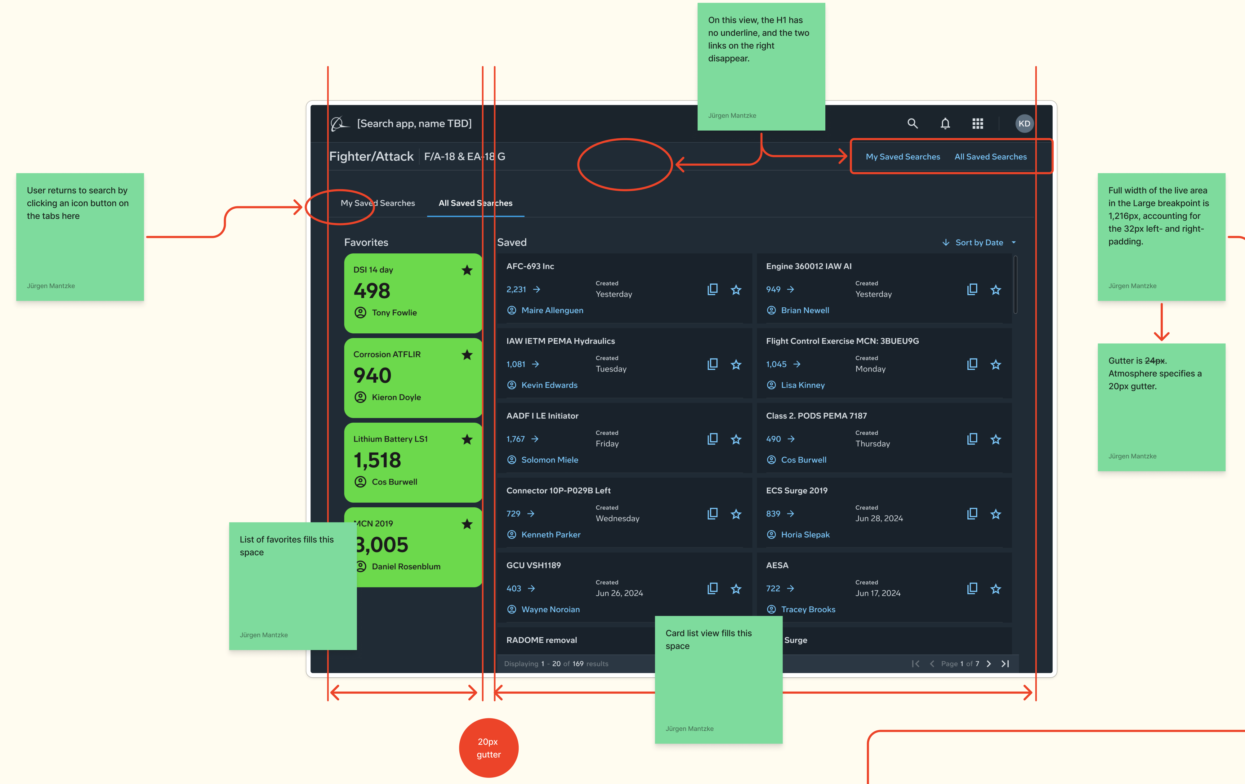
Besides the primary search function, which operated similar to e-commerce sites like E-bay, we added features to filter search, save searches, view other user's saved searches, and see popular queries.
This enabled the tool to work better as a research tool, so that users could get trusted data about maintenance trends and anomalies around not just a fleet, squadron or tail number, but also operational theaters and aircraft platforms (models).
Impact
Without the ability to do follow-up analysis, the actual impact of the new design can only be conjecture. While it was in development, the SMEs who advised the entire design process expressed confidence in the improvements it would bring.
Lessons learned
Data gathered from numerous interviews with SMEs for different platforms was sufficiently insightful. But this also brought inspiration on how to craft better questions to get better data the next time we did this.
We did have other digital tools for military aircraft platforms, so we were able to bring lessons learned as we planned those discovery phases.
It was challenging to find the right SMEs. We conducted a couple of design sprints during discovery, and found, too late, that we had brought in the wrong SMEs.
From this we crafted better screening surveys.
We found that, in many cases, maintenance data would be acquired on the flight line, and many SMEs indicated doing the work on a tablet computer would be helpful.
In a few cases the SMEs would not have internet access, as areas where military aviation maintenance was completed had restricted networks. The ability to do the work offline would be helpful.