
 Enfineitz
A Brand Identity Case Study for American Gold Trading
A former coworker approached me for a branding kit after being underwhelmed by AI‑generated options and uncertain about what Etsy vendors actually delivered. He wanted something affordable but strategic, something AI alone couldn’t produce. I matched the $500 Etsy price point, applied a friend discount, and expanded the scope to include competitive research, interviews, six logo concepts with revisions, six color palettes, six type pairings, and email templates. My guiding principle was that AI can execute, but humans define meaning.
Discovery and research
American Gold Trading operates in the collectible coin market, a space defined by trust, heritage, and investment value. Competitive analysis revealed a sea of nearly identical brands—warm metallic palettes, literal coin imagery, and templated logos. None expressed the personality or values of the businesses behind them.
I asked the client why AI hadn’t worked. The answer confirmed my hypothesis: without a strategic brief, AI produced visuals with no emotional or conceptual grounding. This clarified my role—build the strategy first, then use tools tactically.
Strategic direction
Before designing anything, I defined what the brand needed to communicate: credibility, heritage, and seriousness—without falling into predictable “gold coin” clichés. The audience consists of collectors and investors who value authenticity and do their homework. The brand needed to feel trustworthy and knowledgeable, but also distinct within a visually repetitive industry.

Logo system
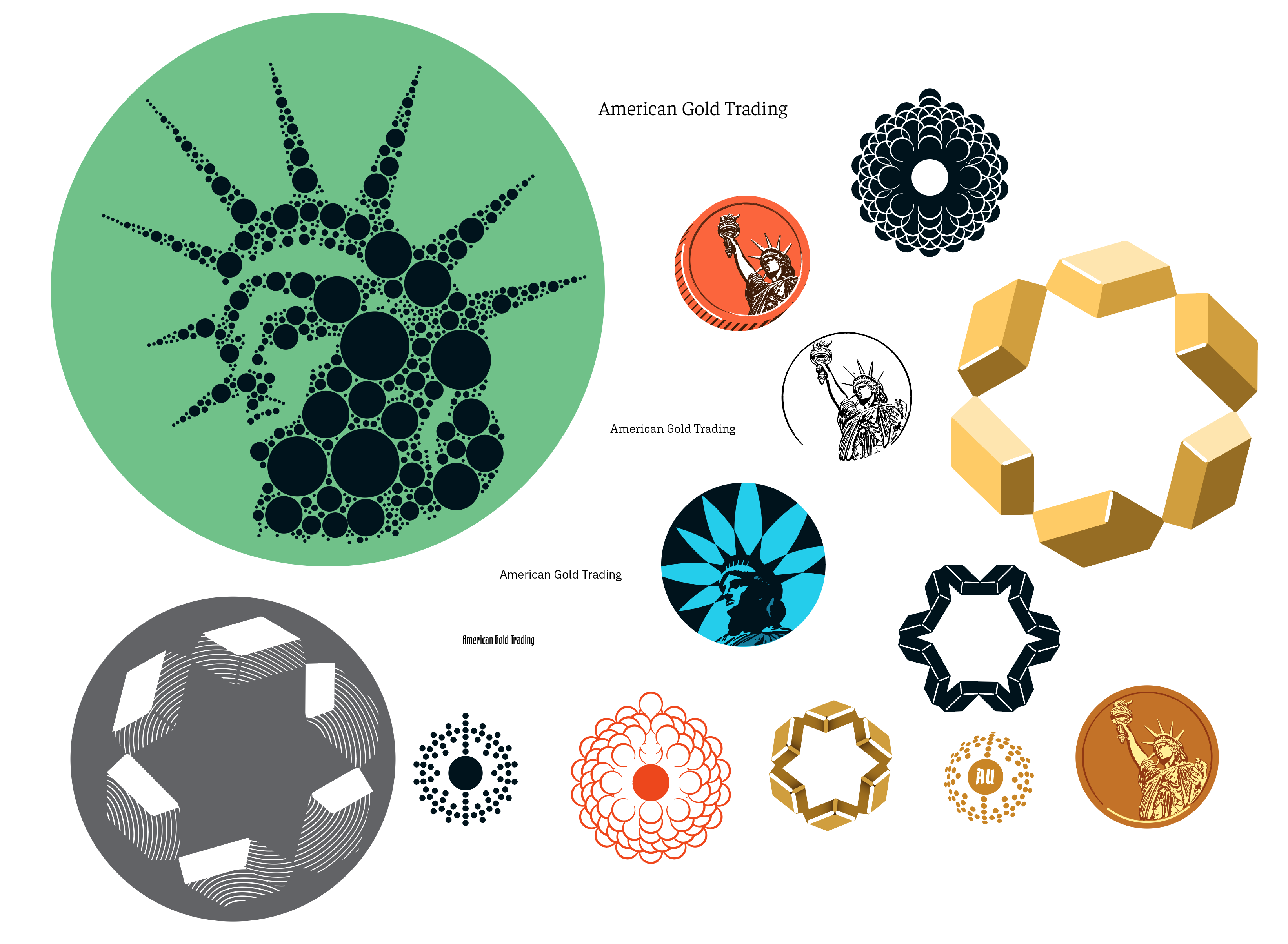
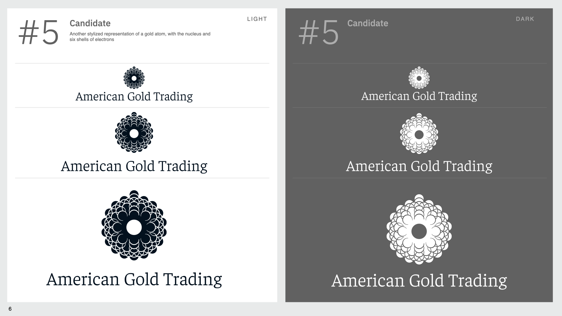
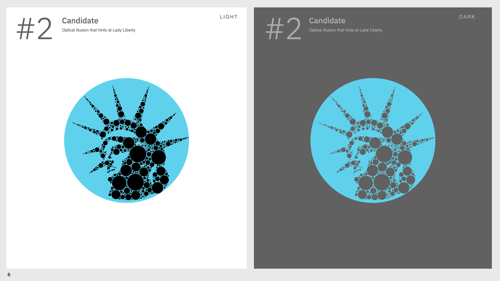
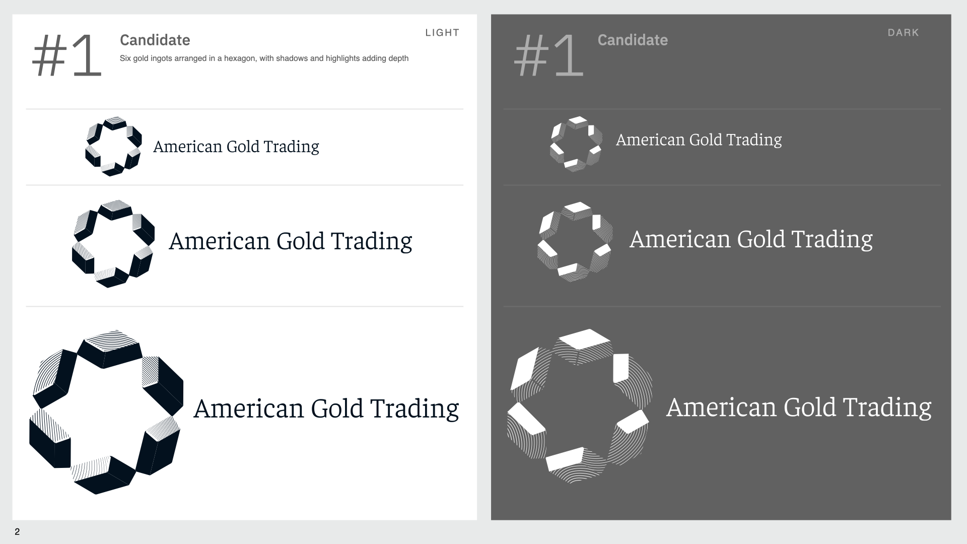
I began with broad exploration—abstract atoms, geometric bullion patterns, and unconventional shapes. Early feedback showed the client wanted imagery with meaning and heritage. That led to the Statue of Liberty.
Lady Liberty appears on real American gold coins and carries associations with permanence, freedom, and national identity. She is recognizable yet underused in commercial branding. To ensure clarity at small sizes, I focused on a cropped portrait with a circular frame referencing a coin. A reeded edge and geometric star details reinforced the connection without becoming literal. I limited the mark to two colors and required it to work in black and white first—if it didn’t communicate without color, it wasn’t strong enough.
Color system
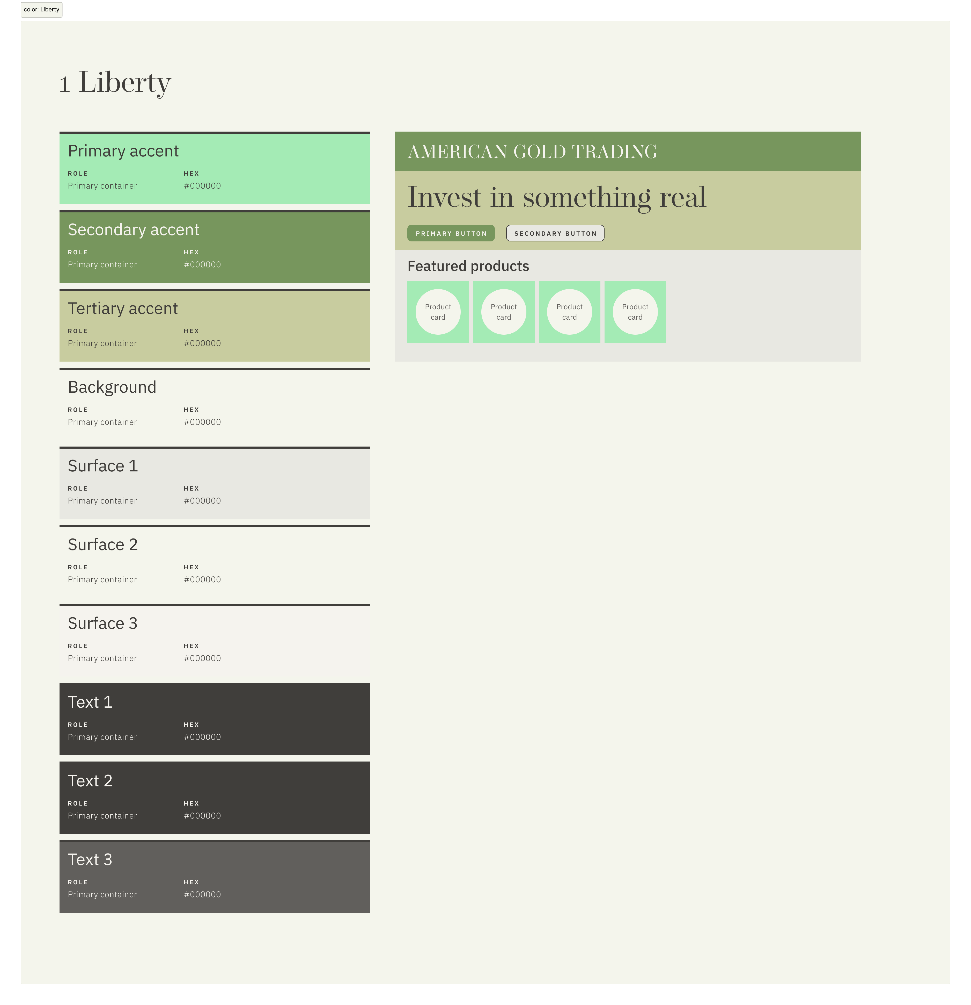
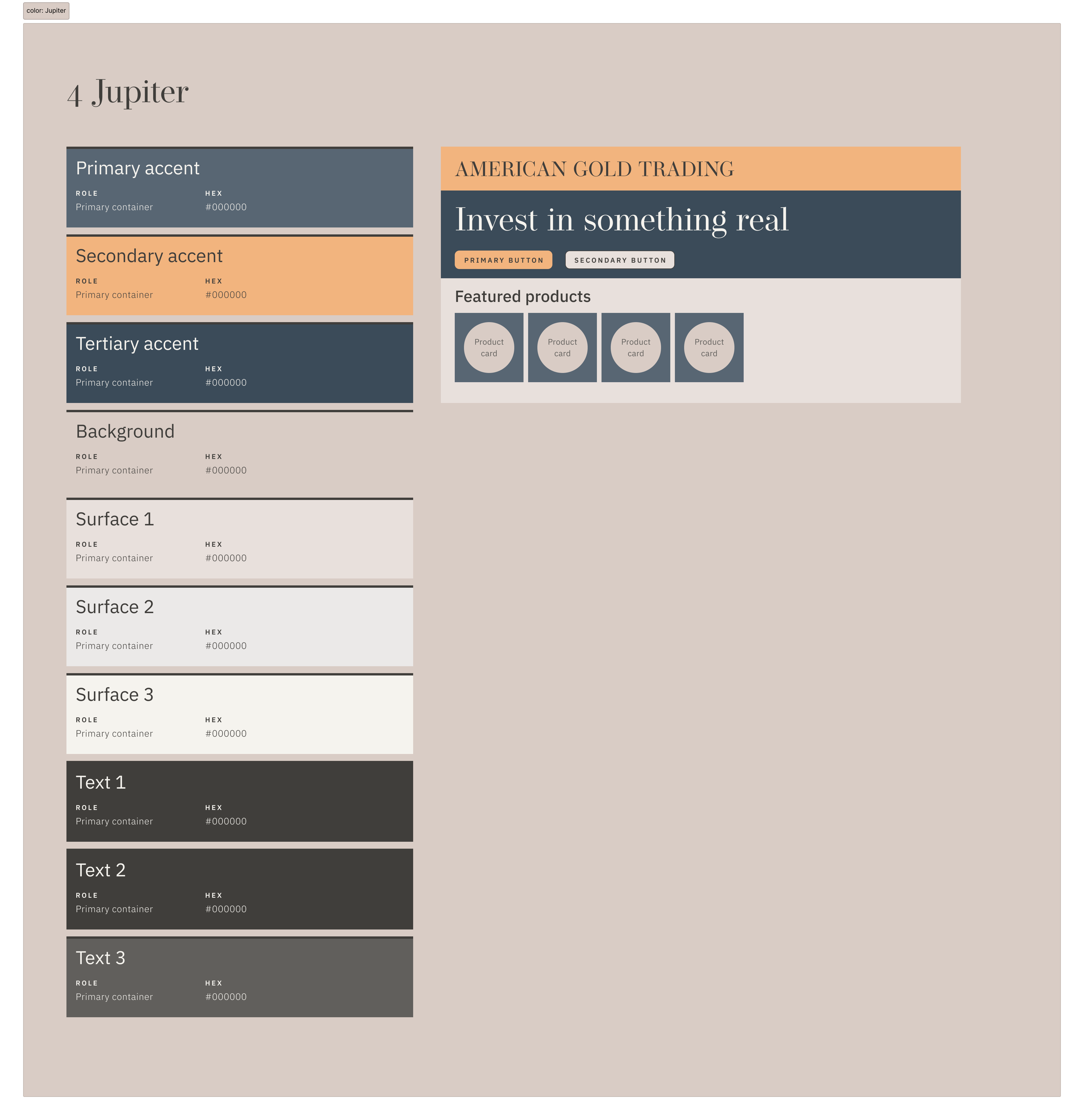
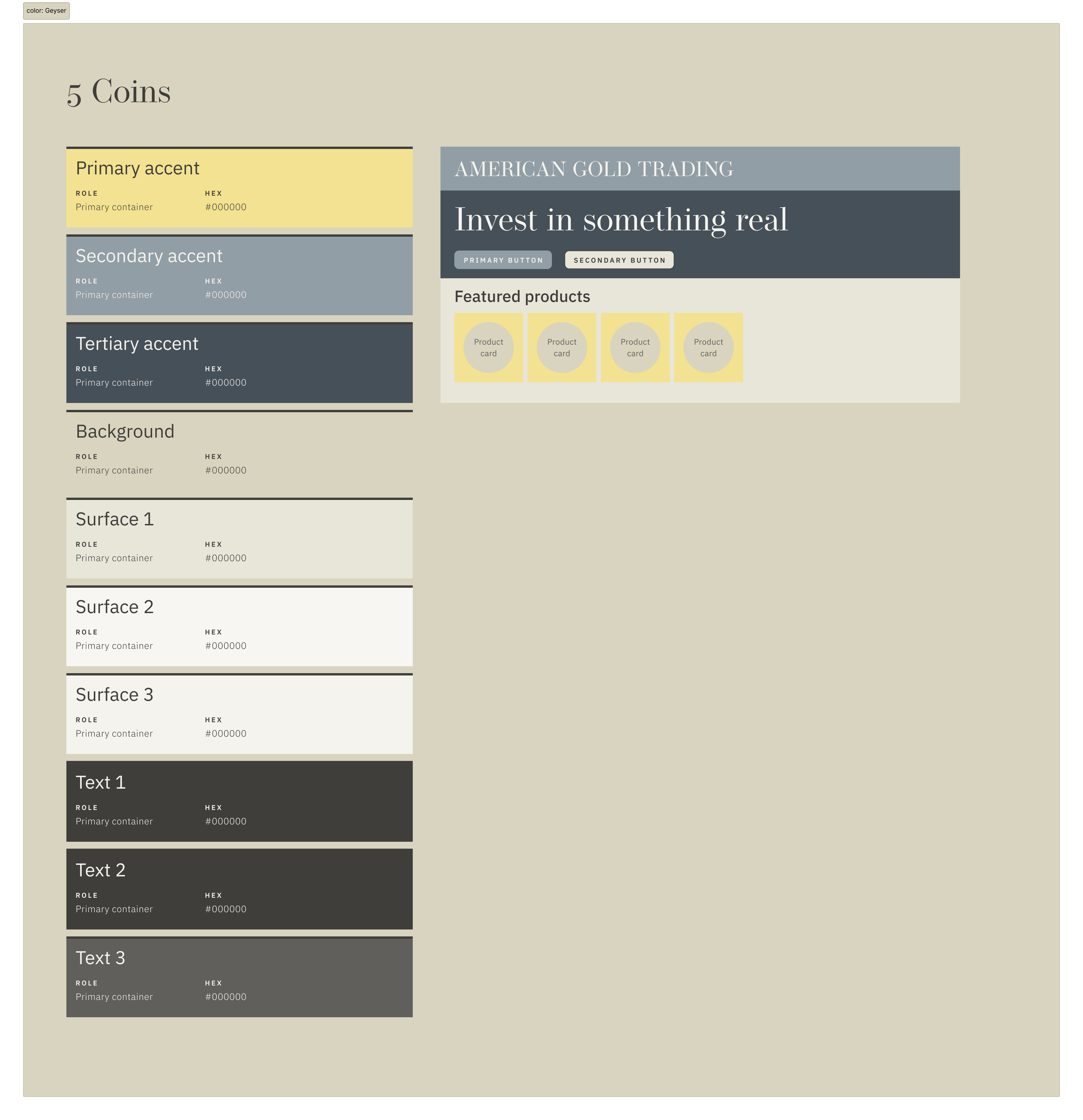
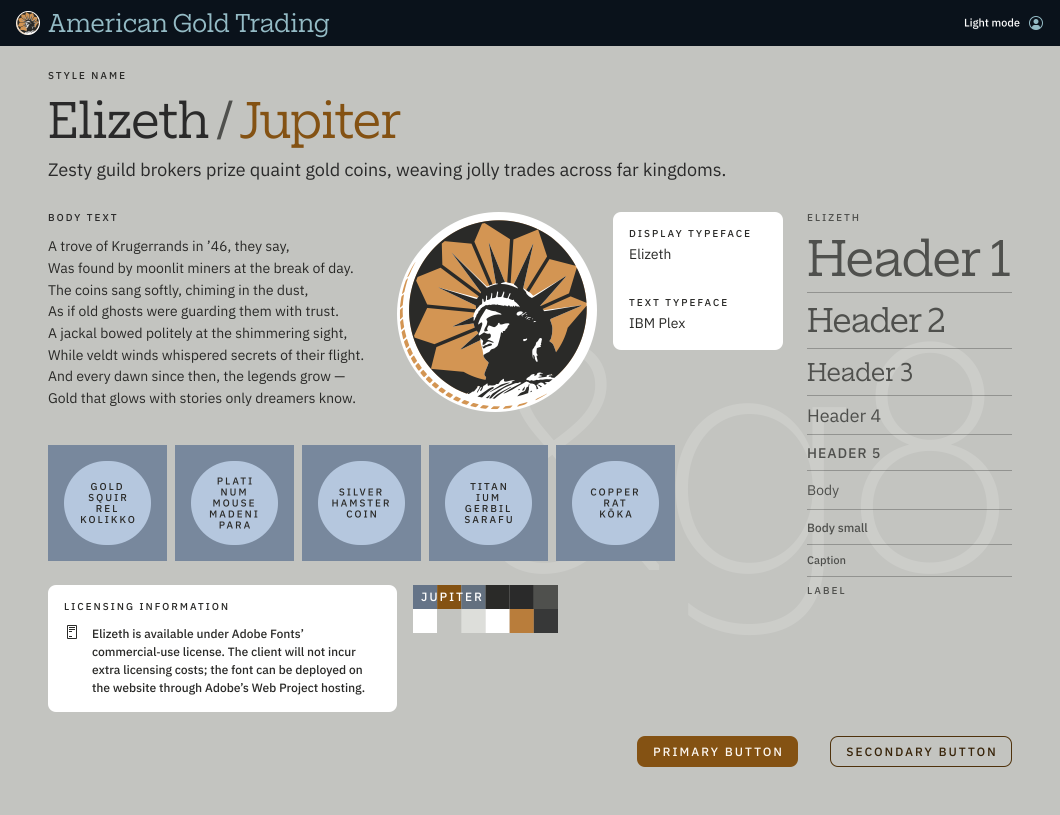
Instead of defaulting to gold tones, I explored color as an independent creative problem. Using Adobe Color and palettes extracted from my Yellowstone photography, I created six distinct themes: Liberty, Treasure, Coins, Jupiter, Geyser, and Spring.
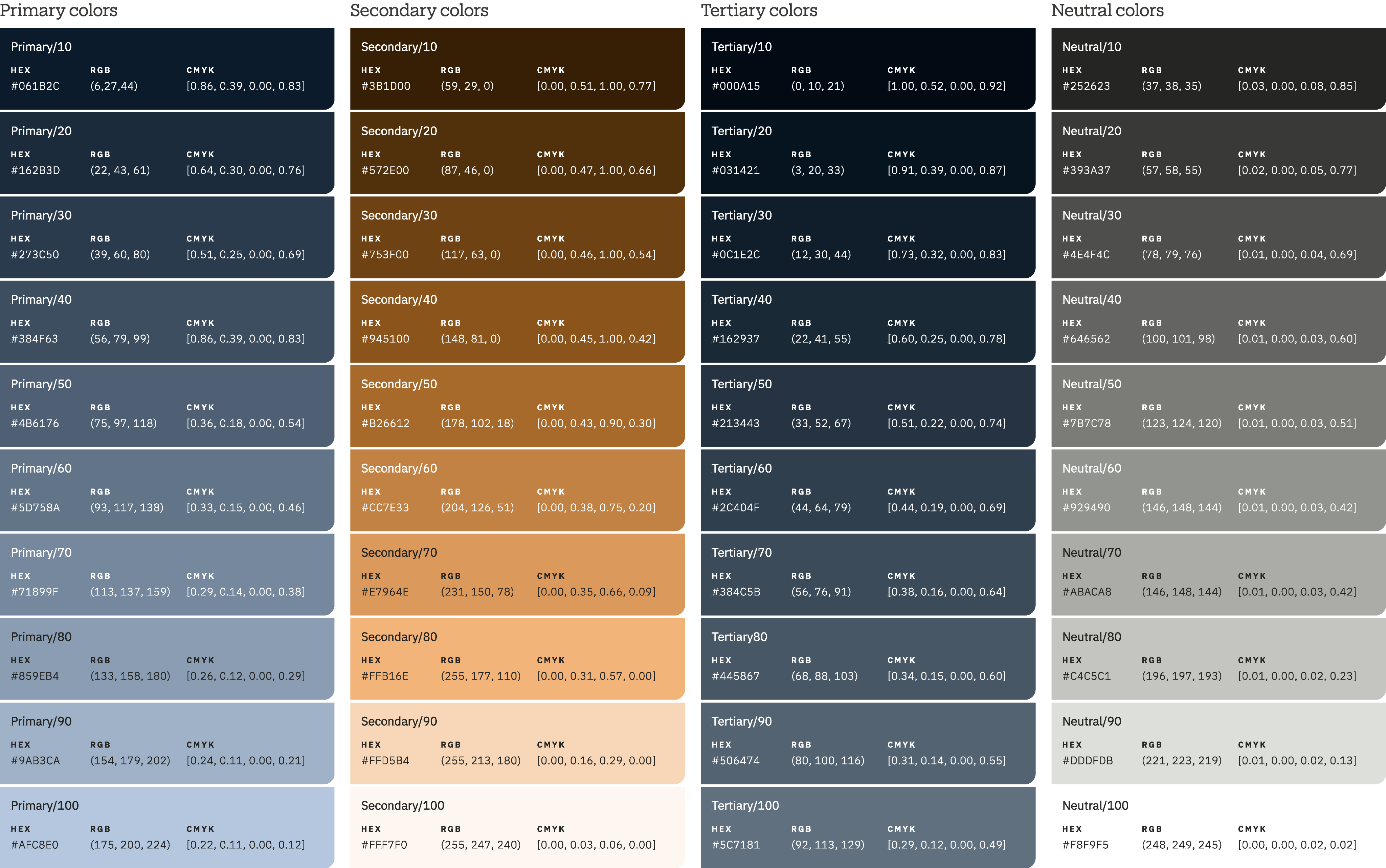
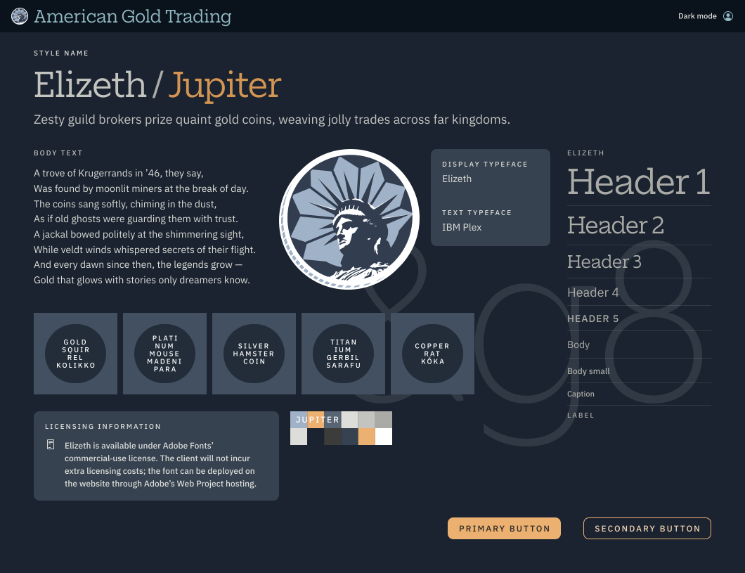
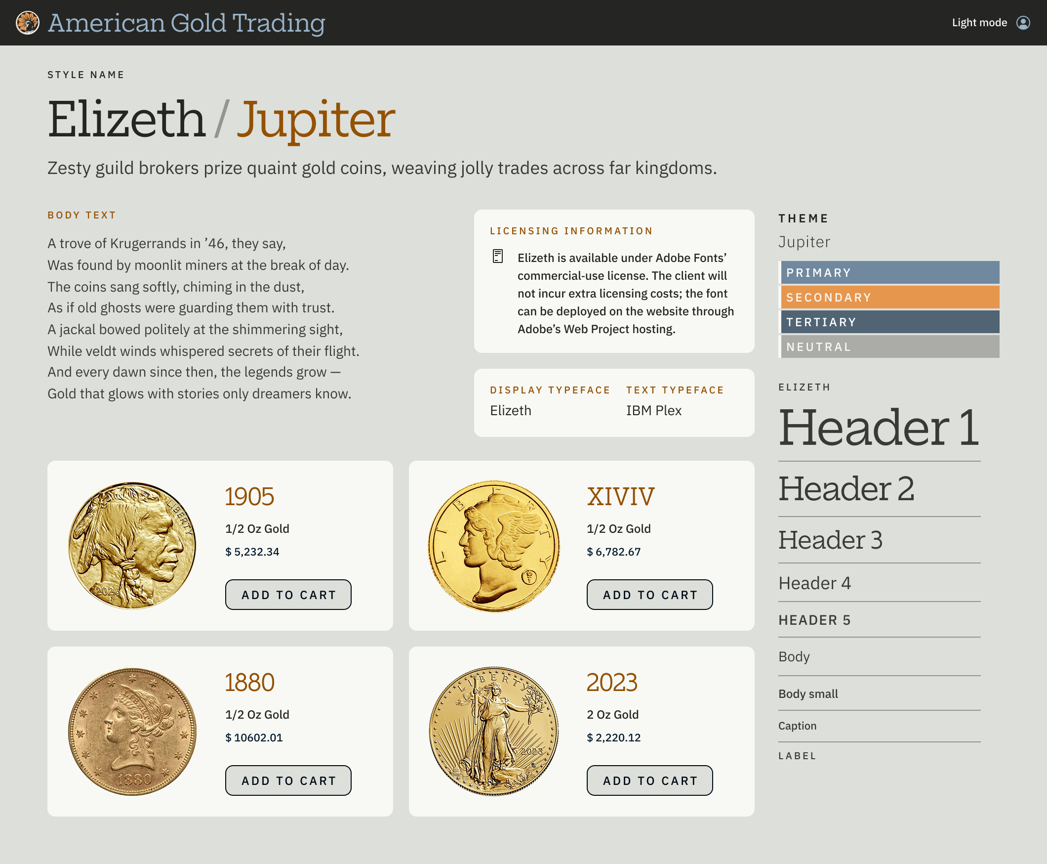
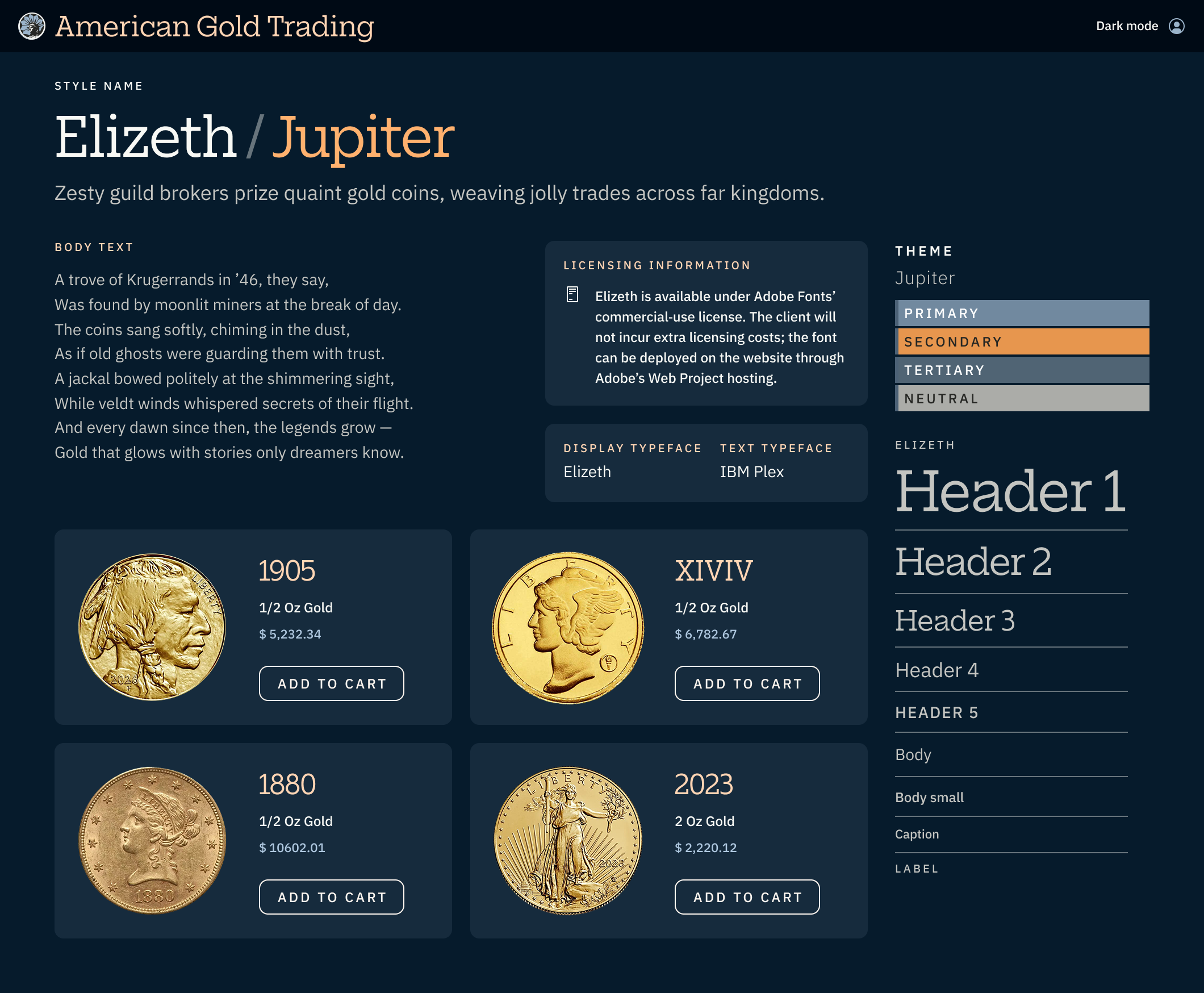
The client chose Jupiter—a palette of warm ambers and cool steel blues. It was the least literal option but carried the right emotional weight: ancient, powerful, and authoritative. The amber reads as “gold‑adjacent” without being cliché, and the blue provides a strong dark‑mode counterpart.
Building for accessibility
Because the palette needed to work in both light and dark modes, I validated all text/background combinations against WCAG AA contrast requirements. I used AI to generate a contrast matrix, then converted the approved pairings into named Figma variables. The result was a documented, auditable color system that prevents accidental accessibility violations.
Typography
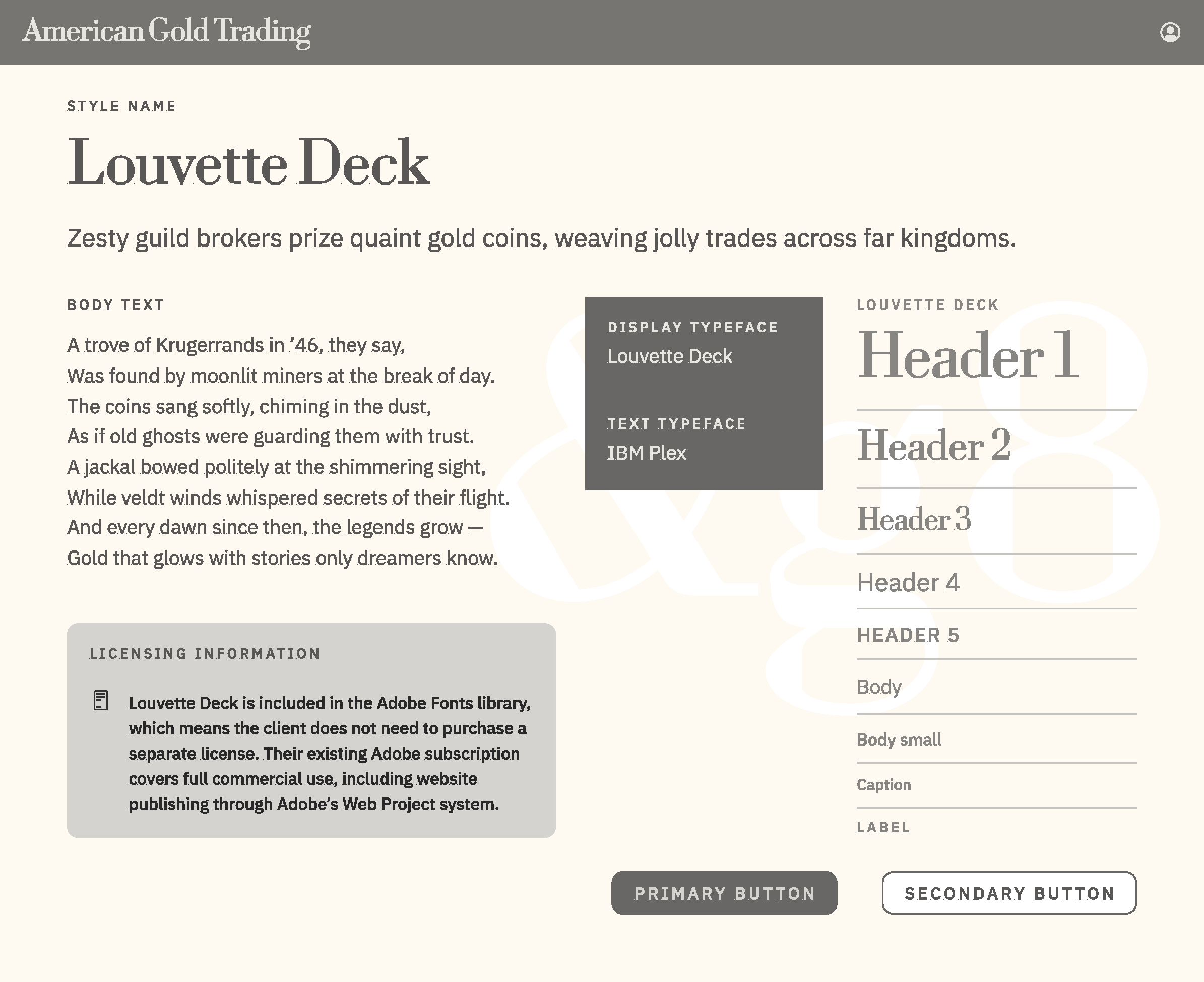
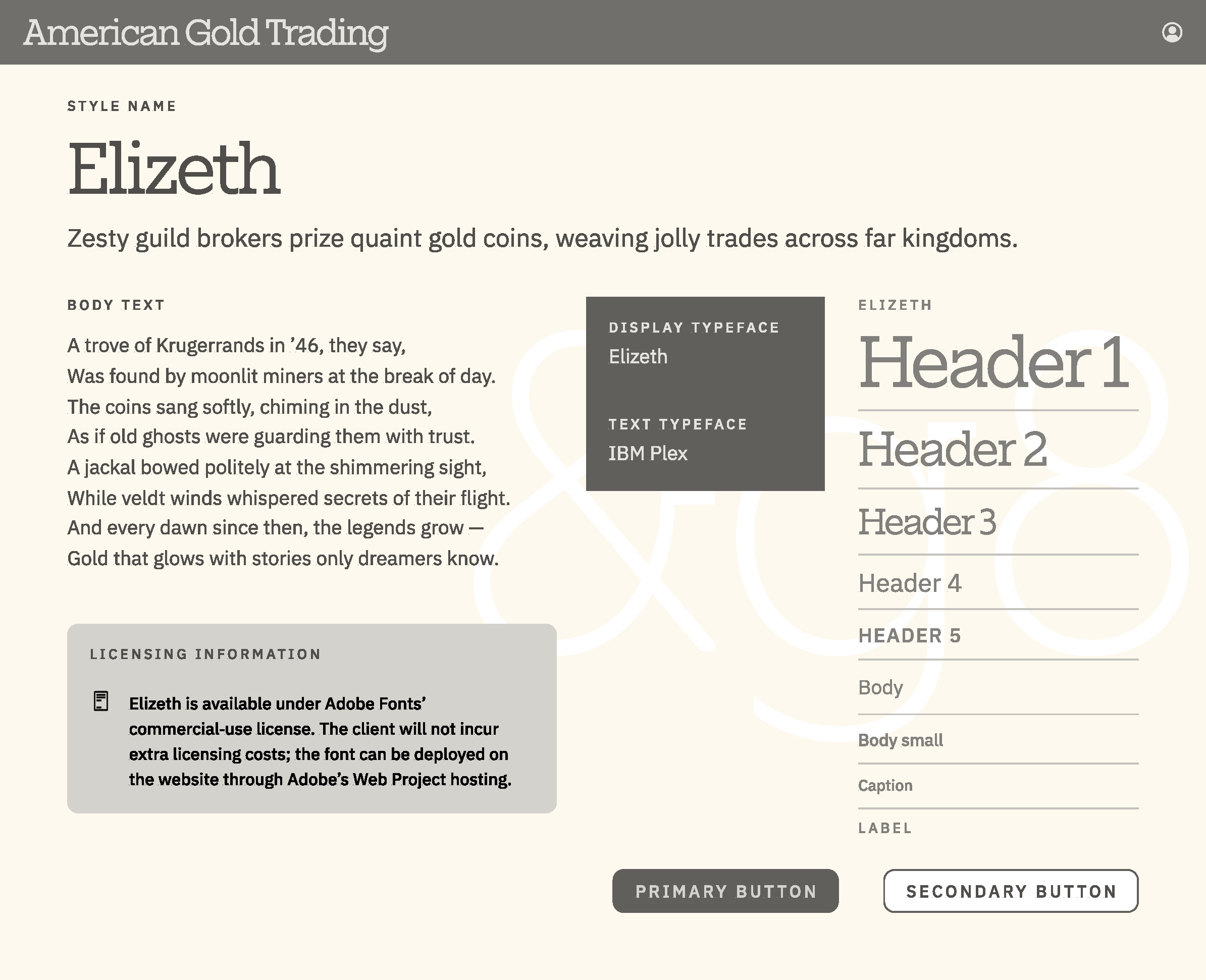
I constrained the body font to two highly legible, systematic options—Noto Sans and IBM Plex Sans. For display type, I auditioned two dozen candidates using the full brand name as the test phrase.
The final pairing was Elizeth + IBM Plex Sans. Elizeth brings modern authority without nostalgia; IBM Plex provides clarity and structure. Together they communicate a brand that respects tradition but operates with contemporary rigor.
Deliverable package
The final kit included:
• Logo files in PNG, JPG, AI, SVG, and GIF (RGB + CMYK)
• Favicon
• Full Jupiter palette with HEX/RGB/CMYK codes
• SCSS tokens with semantic color roles
• WCAG AA accessibility documentation
• Typography guide with licensing notes
• Two UI mockups demonstrating the system in context
• A branded email template
I also built a design‑token system in Figma—color variables, type styles, spacing, and breakpoints—to ensure consistency across all deliverables.