
 Enfineitz
Turning a command line into a story a data-center admin could read
A tool with no front door
Hitachi Data Systems sold a portfolio of tools for customers running enterprise data centers. One of them estimated how much space a storage volume would reclaim under compression and deduplication. It worked. It had no interface at all. You reached it through a command line, and it answered with a block of labeled ratios.
The business wanted a GUI to raise customer engagement. The users were data-center administrators, the production cycle ran three months, and the engineering team and product owner worked in Yokohama, Japan. I was the only member of the team outside Japan.
I did not have user research, usability testing, or discovery sessions. There were no success metrics before or after. No shared time zone, and no shared first language. This was 2016, before I used Sketch and a year before I started using Figma, so I drew every screen in Adobe Illustrator.
What I had was two slides.
The design problem not framed
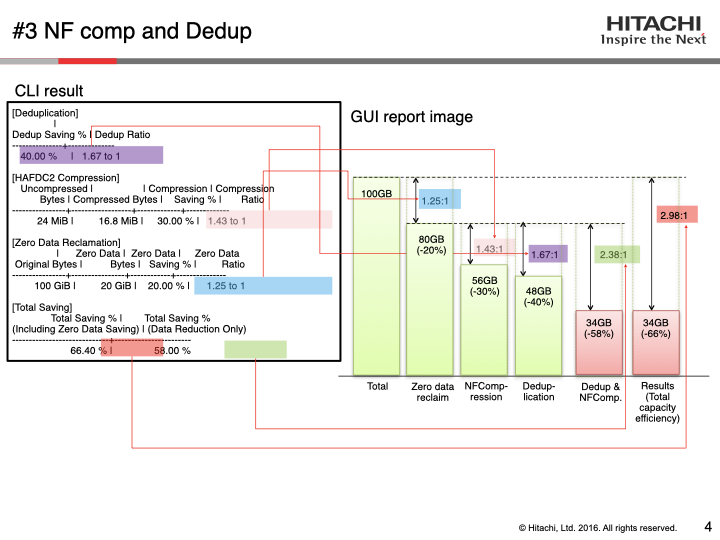
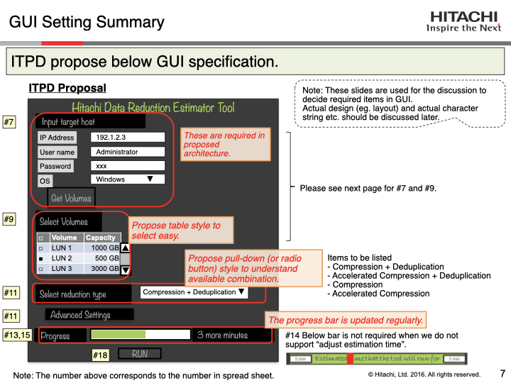
The product owner sent me two slides. The first sketched a GUI, a dark panel with fields for a target host, a small table of volumes, a dropdown for reduction type, and a progress bar. The second showed the tool's actual CLI output, with deduplication ratio, compression ratio, zero-data reclamation and total saving, and red leader lines drawn from each number to a bar chart the team hoped to produce. A spreadsheet sat behind the numbered callouts. The team showed it to me once, and it was dense enough that only a subject-matter expert could comprehend it, but not a UX designer like me.
It was the entire brief. Working from it, I came to think the request had been framed wrong.
Two problems sat stacked on each other. The first was sequencing. Running an estimate meant supplying a host, choosing volumes, and picking a reduction strategy, and those choices interact. The second was comprehension. The CLI reported the truth, but only to someone who already understood what deduplication and zero-data reclamation did to a volume. If the point of a GUI was to make the tool human-friendly, reformatting the ratios into a chart would not get there. The interface had to carry a mental model, a picture of what happens to a volume while the tool works.
I could not build that model until I understood the process myself. Getting there is most of what this project was.
Sequencing the job
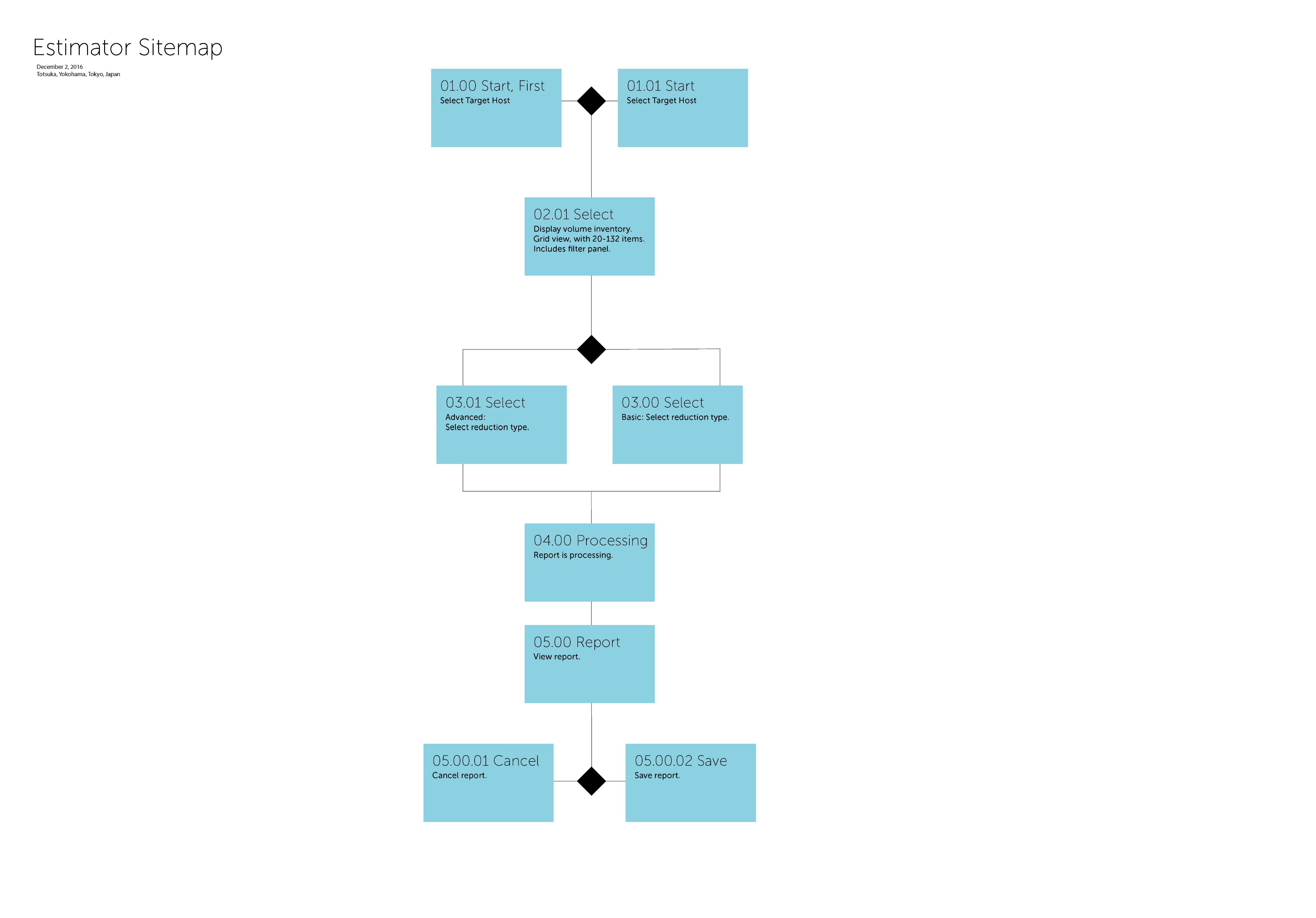
I built the flow as a stepped wizard so the administrator faced one decision at a time. My sitemap, drawn in Japan, showed five steps. I consolidated the last two into four for two reasons. Every step stole vertical space from a fixed application window, and the pattern I was designing only survives at a small number of steps. It would break at ten.
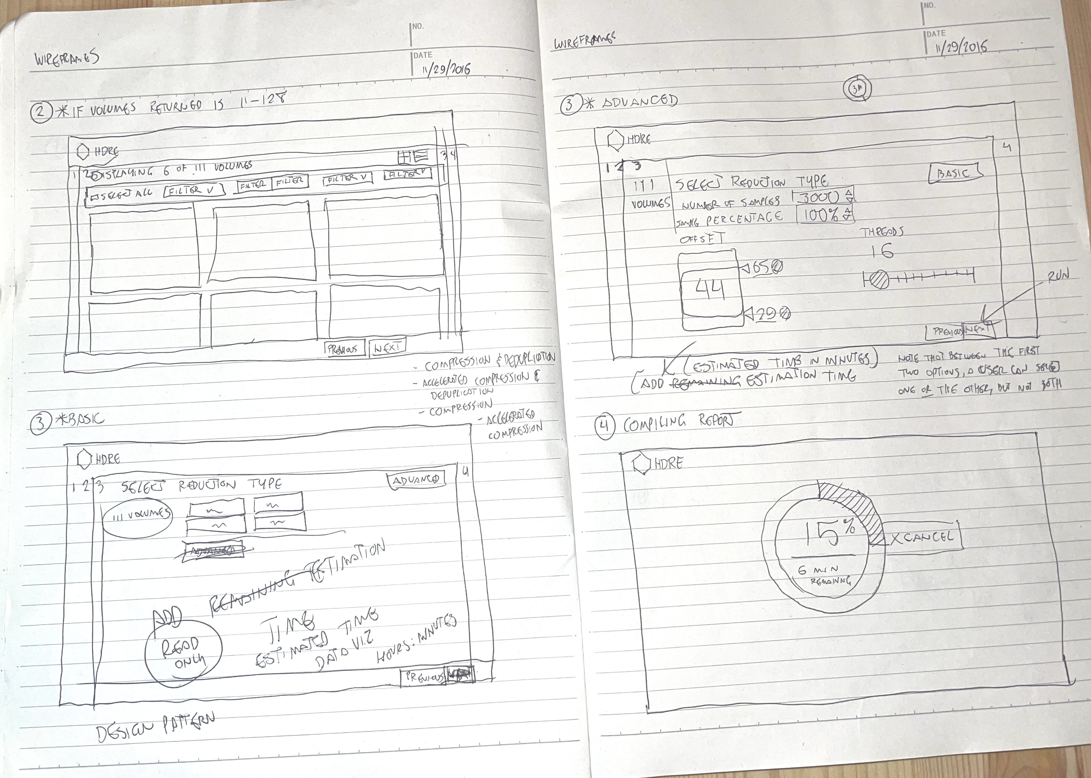
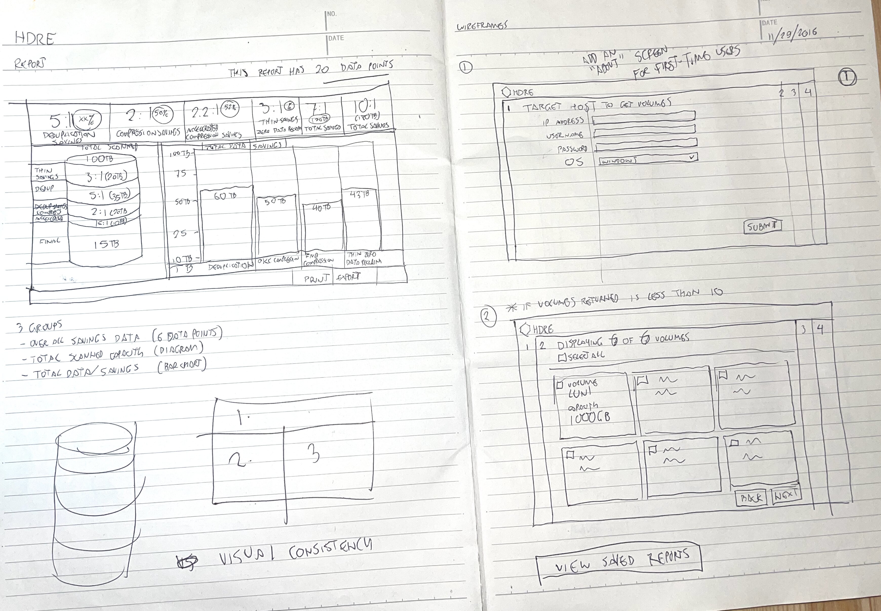
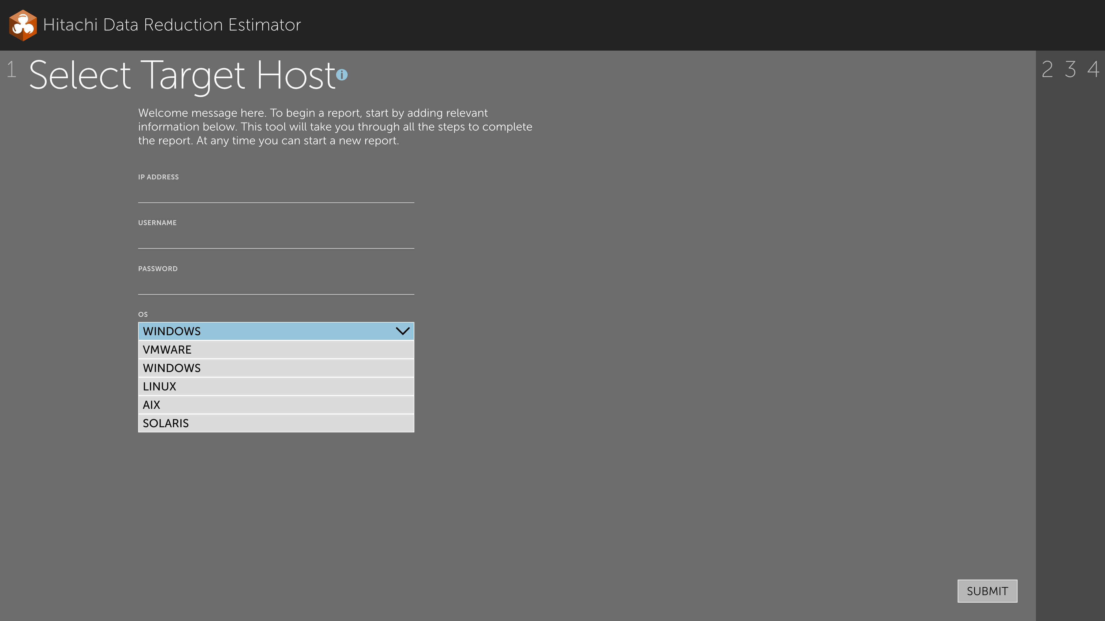
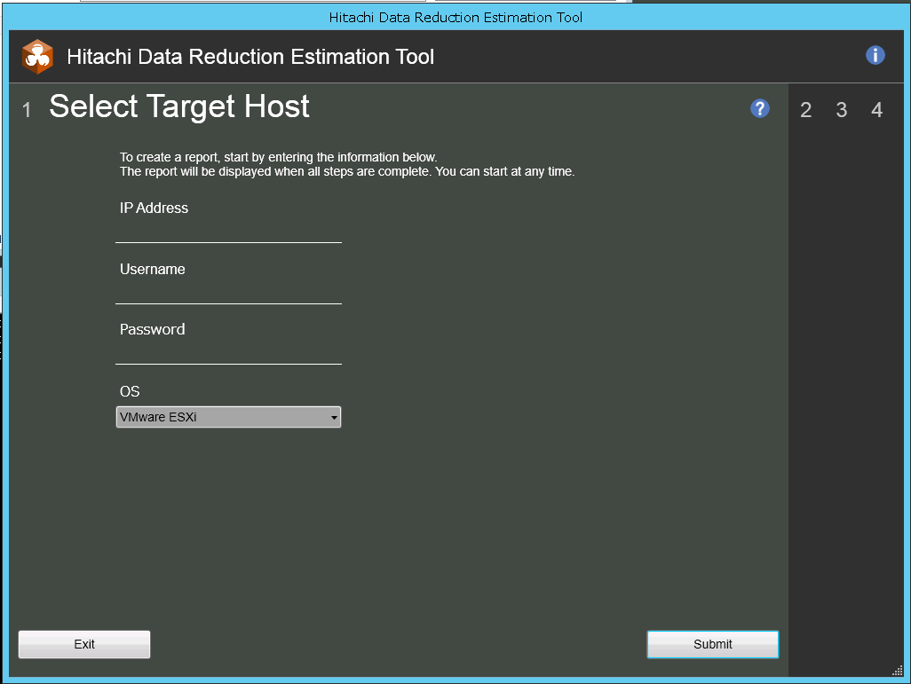
Step 1, Target Host. IP address, credentials, and operating system, with a variant for a first-time user arriving at an empty form.
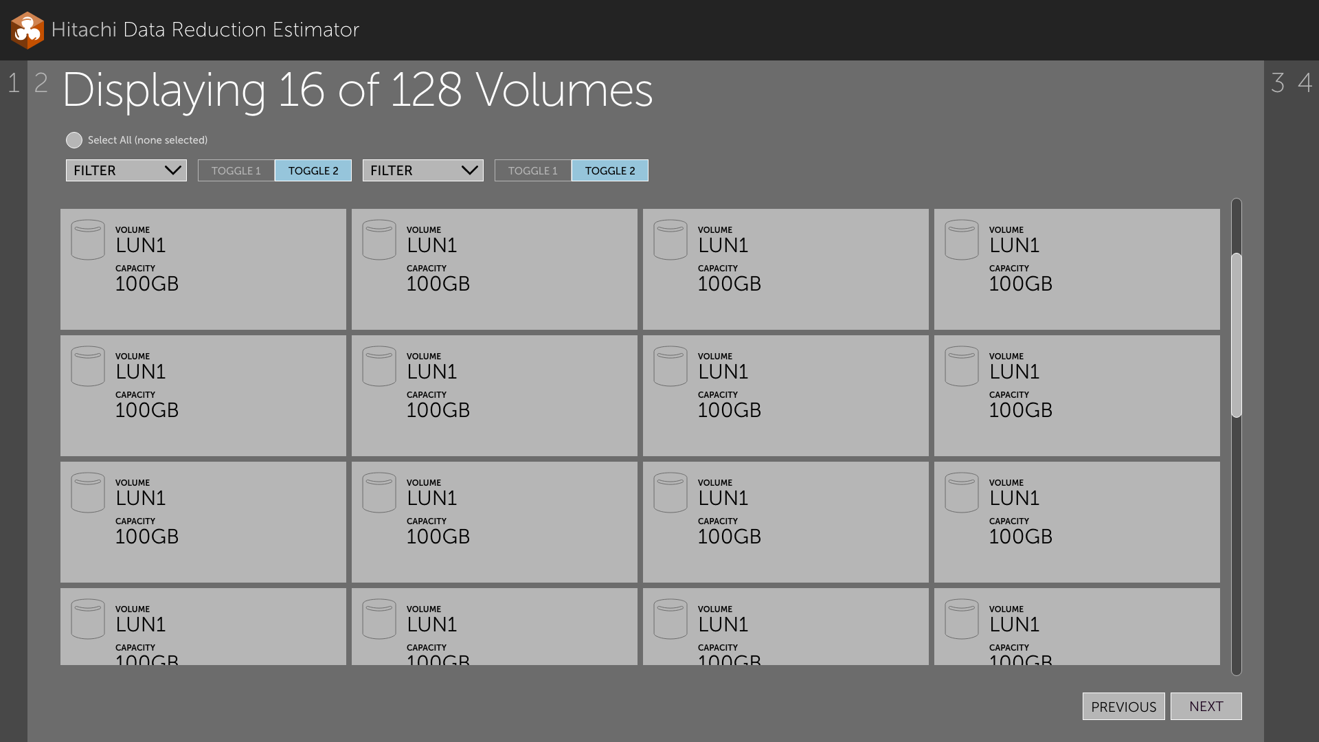
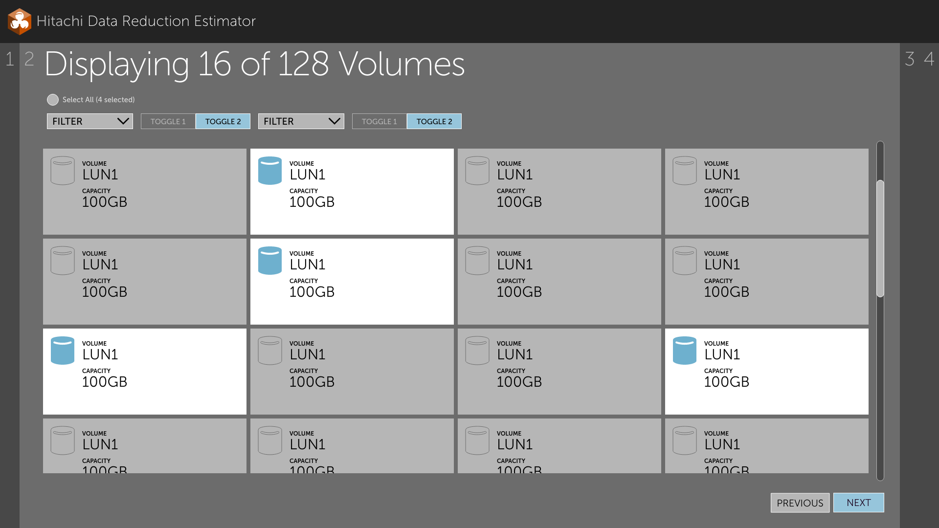
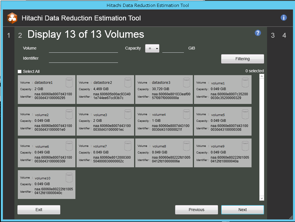
Step 2, Select Volumes. The proposal called for a checkbox table. I argued for a grid of cards. Each volume carries two data points, a name and a capacity, and at two data points a table is the lazy default. It wastes horizontal space, and it shows fewer records before the user has to scroll. Cards let me set capacity in large, scannable type. I used a database icon as the selection control, filled when selected and outlined when not, reinforced by a lighter card fill, so an administrator could read selection state across the whole grid at once instead of checking one box at a time. The header reads "Displaying 16 of 128 Volumes," with select-all showing a live count. I follow a general guideline with this type of pattern: 20 to 50 items can live on one scrolling screen, and anything ranging into the thousands gets paginated at thirty.
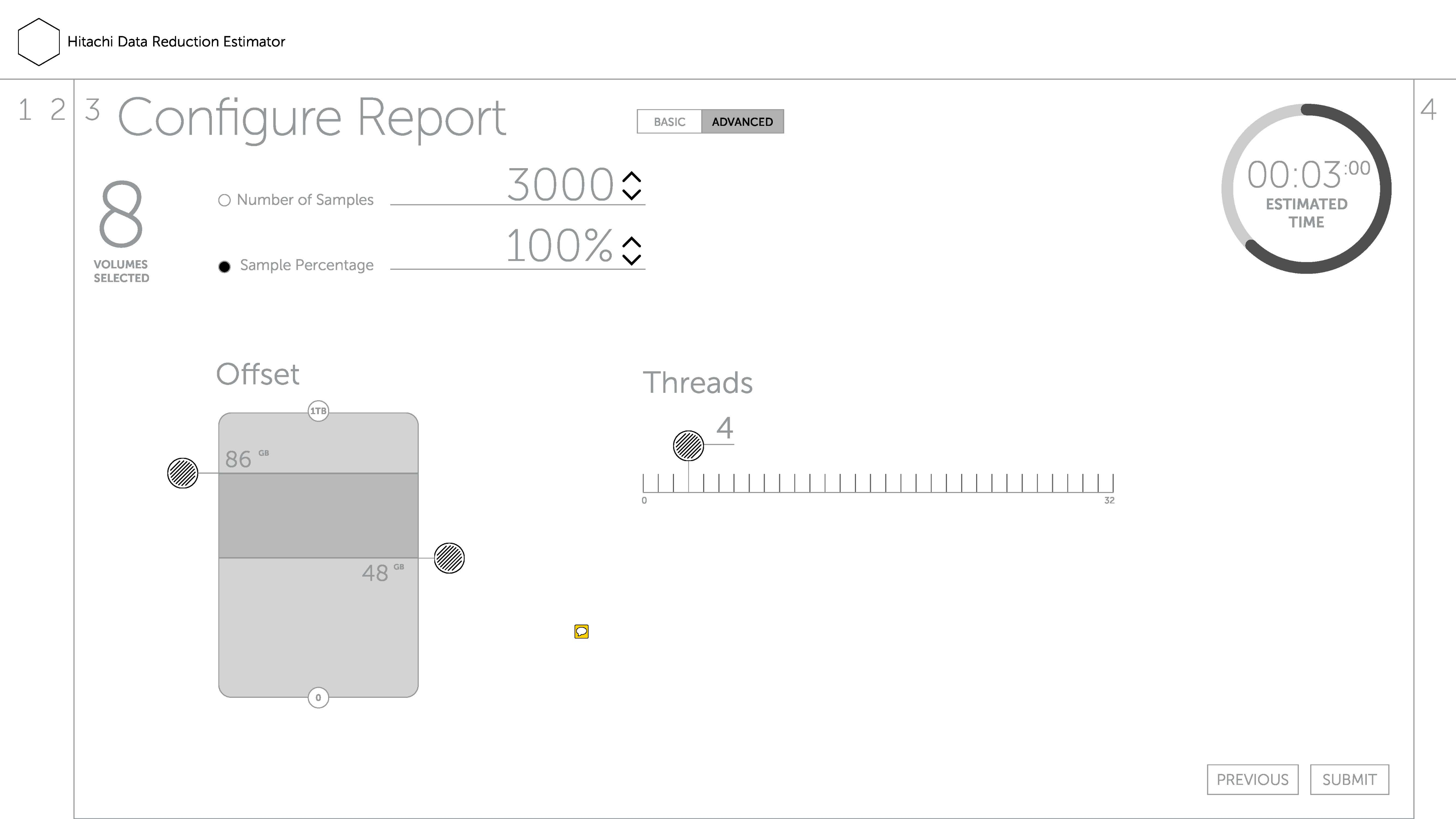
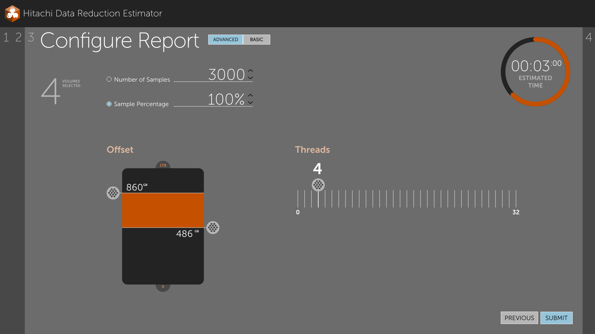
Step 3, Select Reduction Type. Basic offered presets, templates for the common cases. Advanced let an administrator key exact offset and thread values. The split kept the default path short without hiding the controls an expert would look for.
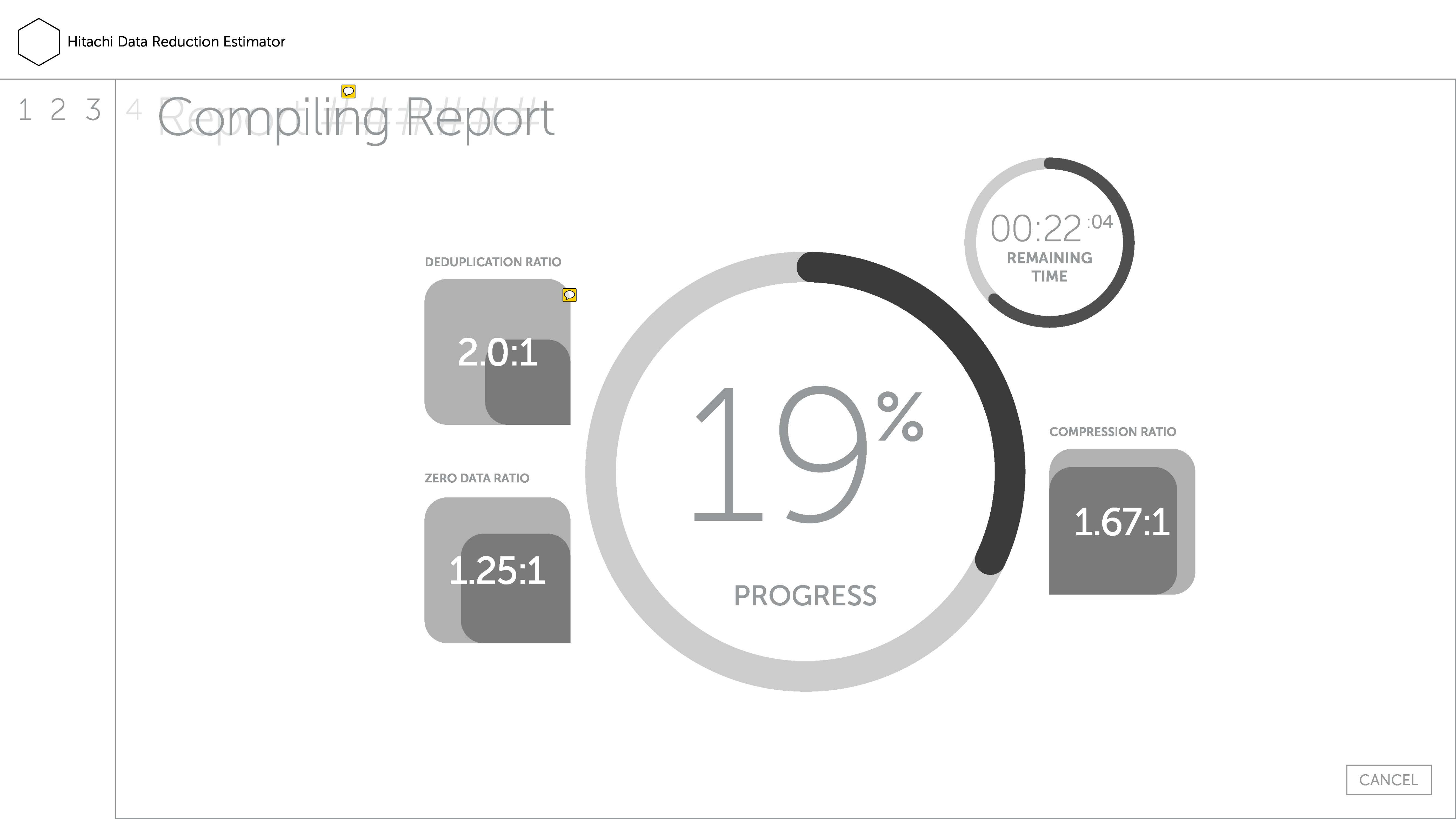
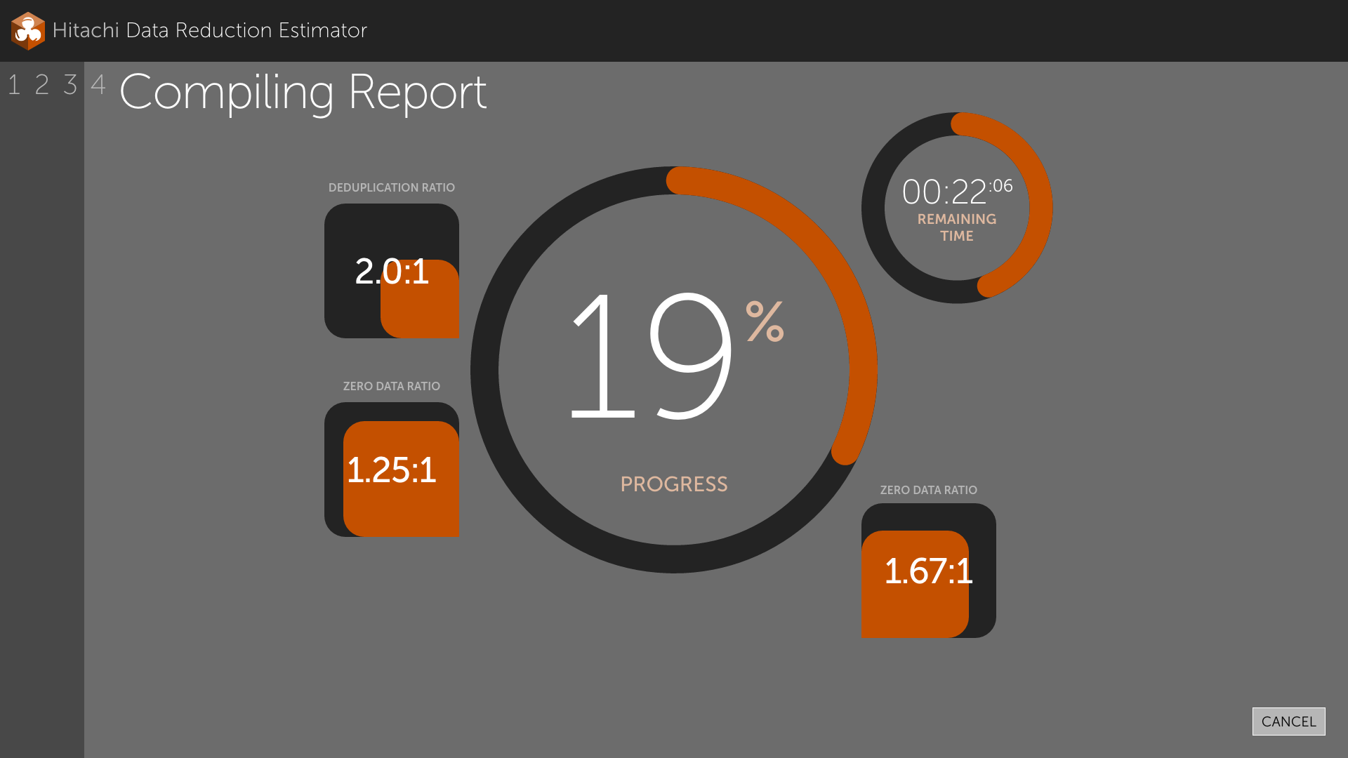
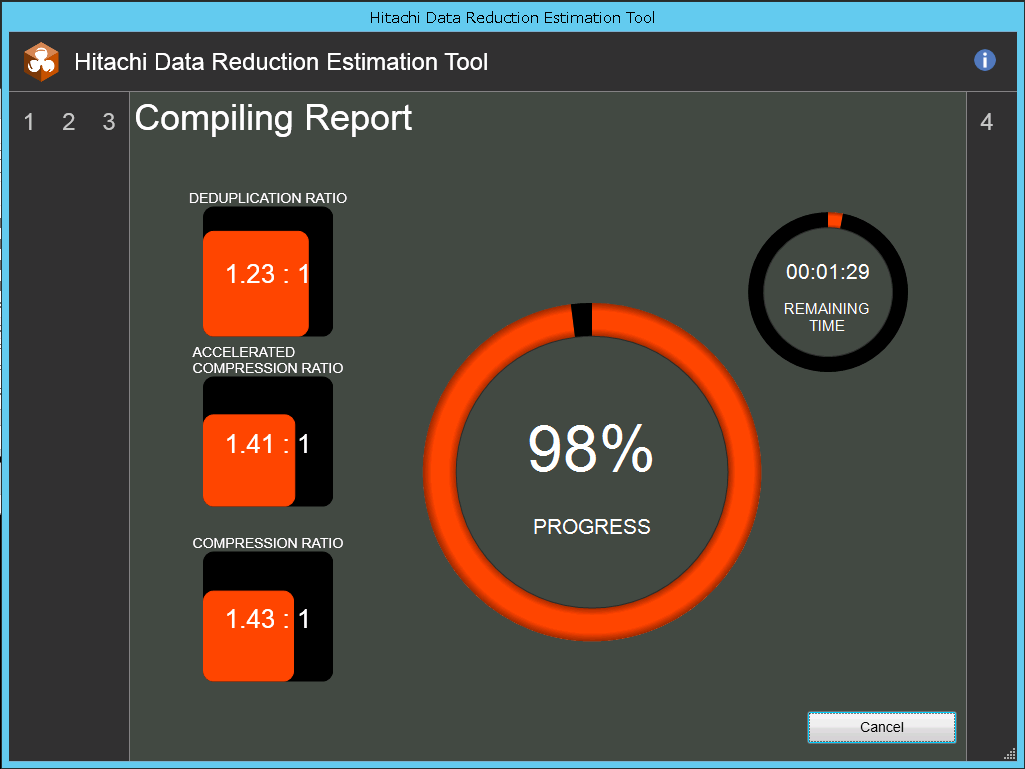
Step 4, Report. Compiling is a state inside step 4 rather than a step of its own. Once an estimate starts running there is nothing to go back to, so I did not add a dialog to say so. The user restarts from the finished report.
An estimate could run for hours. I built the time display as a donut with a six-digit readout, labeled "estimated," because the duration varies and because the number moves as the user changes configuration at each step. Compiling shows two donuts, progress and time remaining. Cancelling discards the report and its results outright.
The step indicator is the piece I am most attached to. Instead of a static list, the numbers sit on either side of the content. Completed steps go left, remaining steps go right, and the current step pulls to the edge of the panel. On step 2 the rail reads 1 2 at the far left and 3 4 at the far right. On step 4 nothing sits on the right at all. Progress becomes spatial, so the administrator never stops to read a widget to know where the work stands.
Making the results legible
The report needed a lot of direct product team collaboration, and it justified the trip.
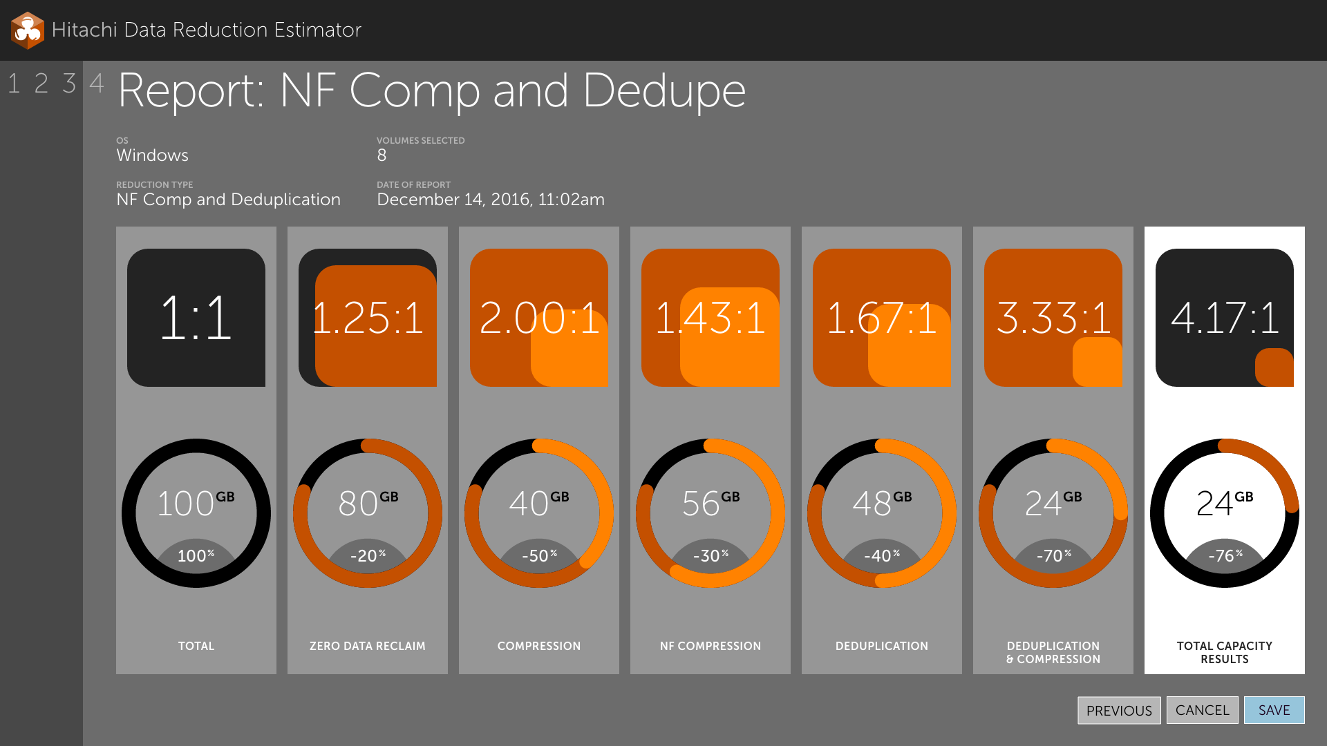
I offered two directions. The first gave every stage its own panel: a ratio drawn as two nested squares, sitting above a donut showing the gigabytes surviving that stage. I got the nested-square idea by asking a colleague in the States with a math degree how you draw a ratio. It is precise, and I still like how it looks. It also asks the reader to take seven separate measurements and assemble the story privately.
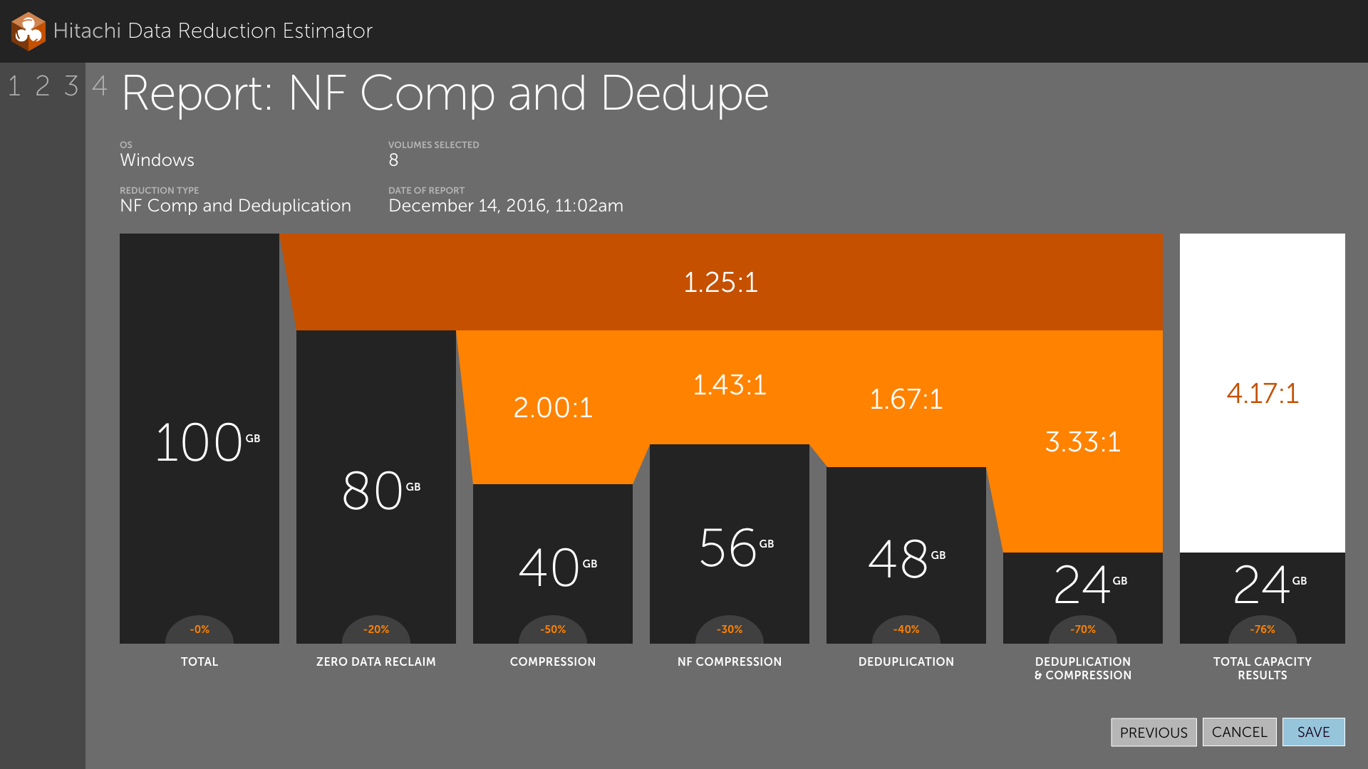
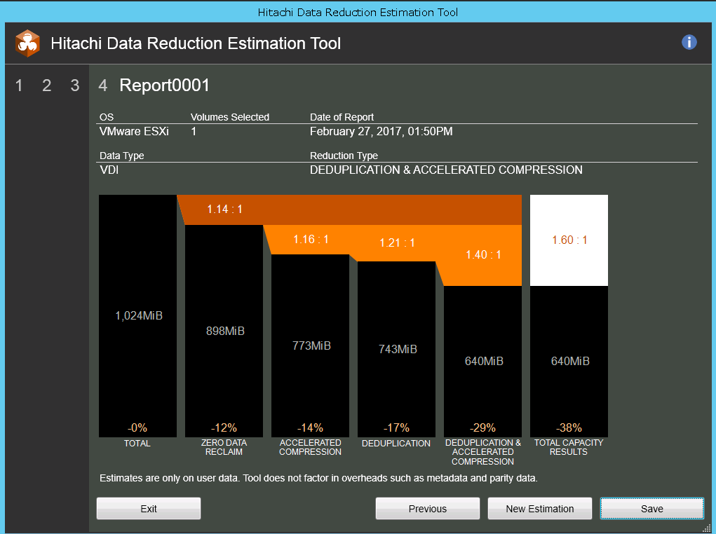
The second direction connected them into one continuous cascade, starting at the volume's full capacity and stepping down through zero-data reclaim, compression, NF compression, deduplication, and the combined pass. Reclaimed space fills in orange above each descending black bar, with the final capacity broken out on the right. None of the underlying numbers changed. The descent made the tool's value visible while it worked, with 100GB entering, 24GB leaving, and every stage in between accounting for where the difference went.
I presented the cascade as the alternate. The team chose it, and it is the version that shipped.
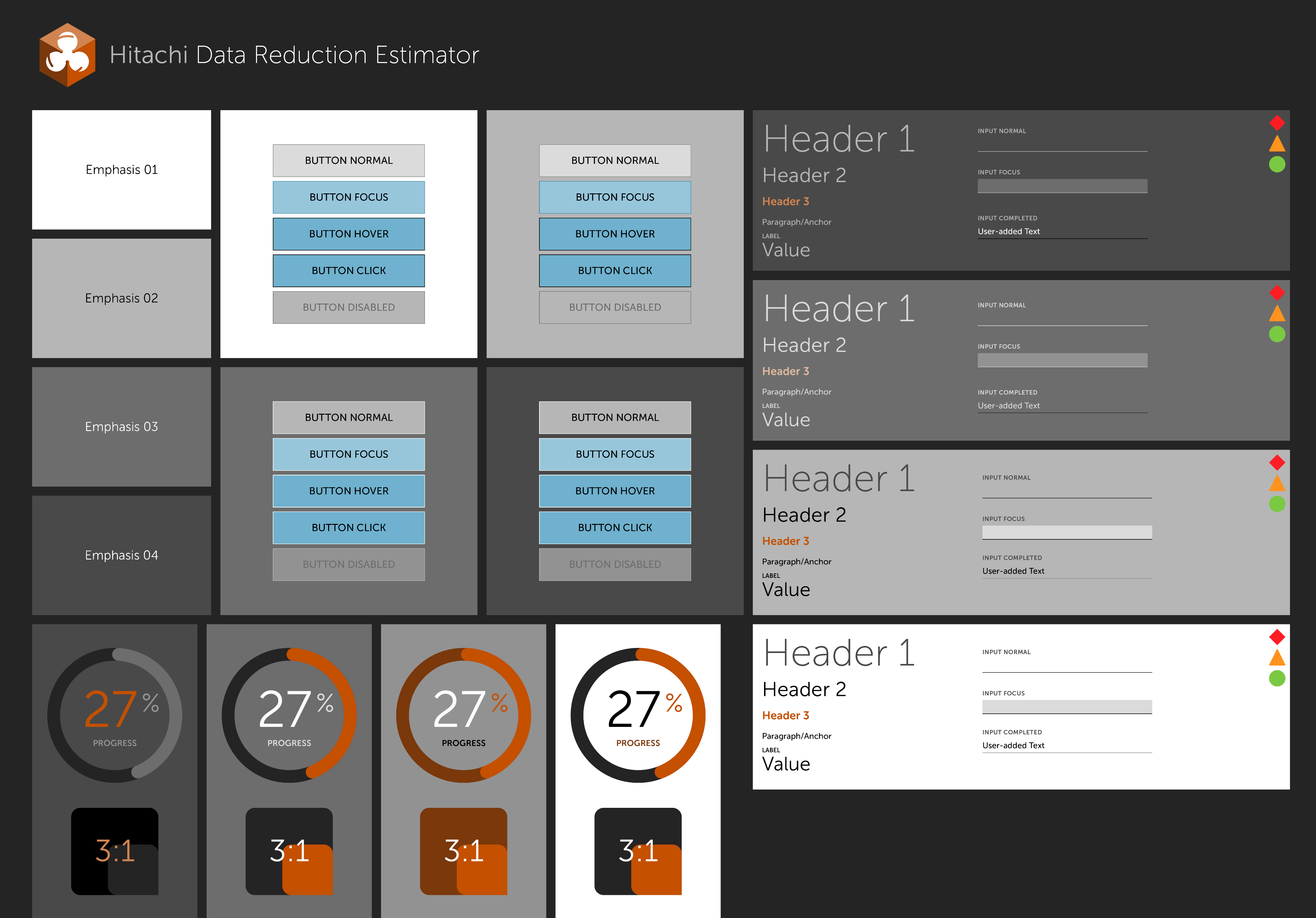
The color came from a small system I built alongside it. I defined four surface levels and restated every component at each one, an elevation set rather than a palette, so I could control contrast against mockups I had not drawn yet. It extended a Hitachi design language I had been developing on a shared wiki for two years. I reserved blue exclusively for interaction: focus, hover, click, and the primary call to action. Orange belonged to data, covering progress, ratios, and reclaimed space. I measured none of it. I was reasoning about hierarchy through surface before I had the vocabulary for it.
Flight time plus four days in Yokohama
We started on video conference. In 2016 the connection was poor, the time difference was punishing, and the subject matter was specialized enough that I needed an expert beside me to make sense of it. My manager concluded the project could only finish onsite. I flew to Japan at the beginning of December 2016 carrying wireframes, and I had four days.
The days ran on Japanese office hours. The team did not work late, and neither did I. The working day went to whiteboard sessions walking through scenarios and iterating Illustrator files, with reviews threaded between. The report screen came out of those collaborative discussions specifically. It took a lot of sketching and a lot of realignment, and it is the one thing here I am certain would not have survived a video call. I had to articulate the metaphor out loud, in front of the person who understood the engine, and watch him accept or reject it in real time.
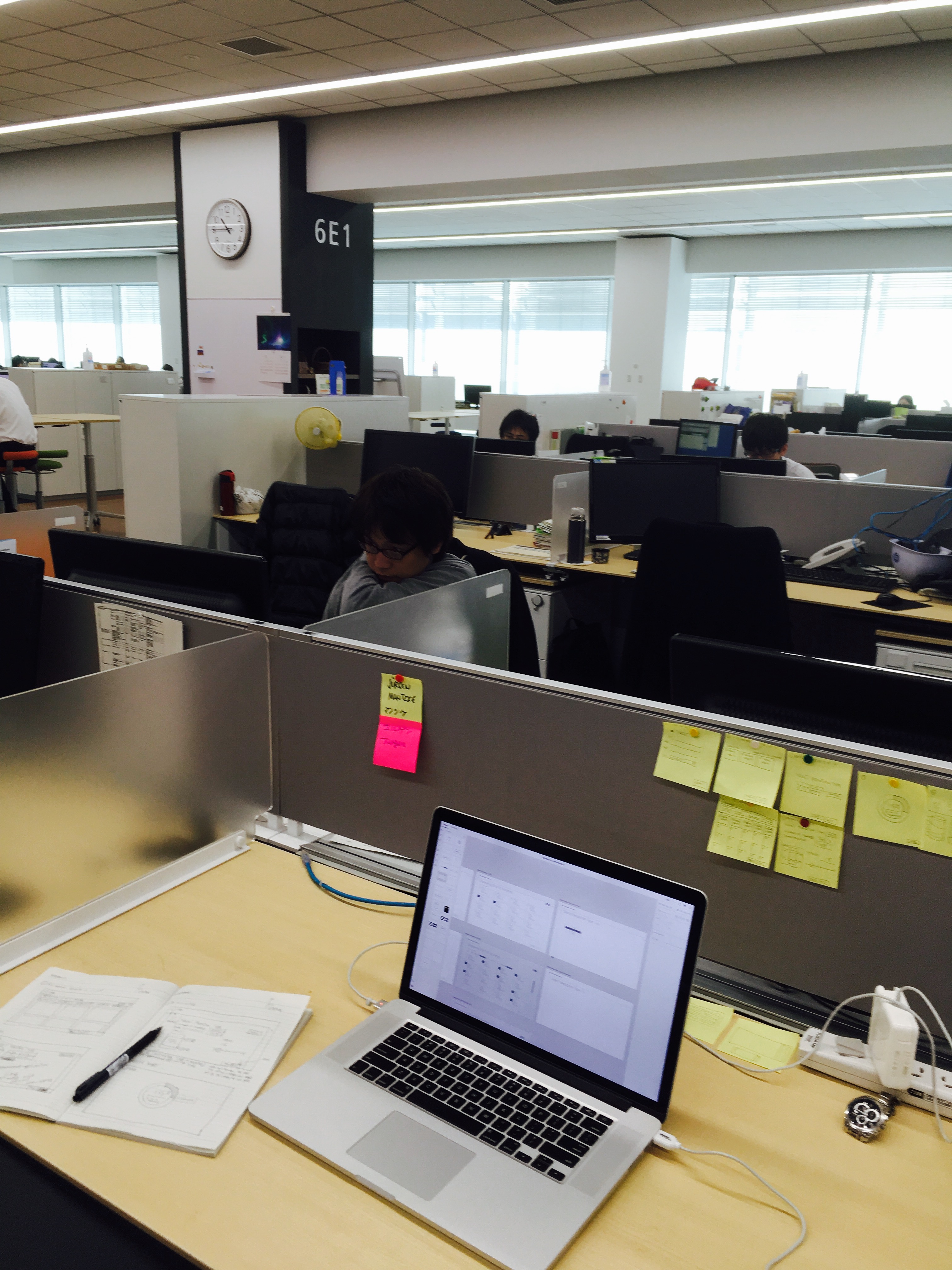
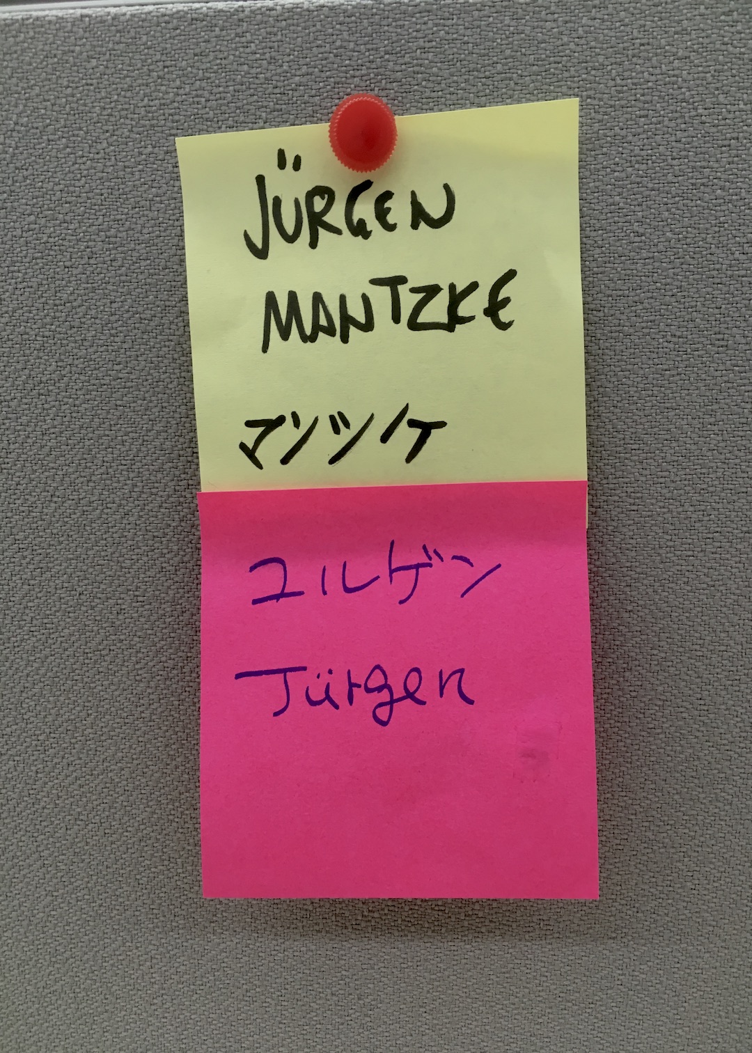
Language mostly held. Most Japanese tech professionals have studied English, and when it did not hold I had help. An American expatriate of twenty years, also a Hitachi employee at the office, got me through the rest. Someone wrote my name in katakana on sticky notes for my desk, so the floor would know who sat there and could pronounce it.
I handed off a PDF with redlines. The team built in C#, so nothing I could produce in HTML or CSS would have been usable.
What shipped, and what I would do differently
The screenshots the product owner sent after launch are about a seventy percent match. The logo is right and most of the color survived. My typography did not, defaulting to C# system styling in Arial. My button hierarchy flattened, so Previous, Cancel and Save carry identical weight and affordance. The step rail collapsed into a static left-hand sidebar and lost the spatial idea. I never saw any of those decisions before the developers made them, since after four days onsite I was effectively off the project.
There are no KPIs here, no adoption numbers, no quotes, and no follow-up study. Enterprise stakeholders routinely deprioritize the parts of UX strategy that would have told us whether any of this worked, and in 2016 I did not have the standing to insist.
Two things changed in my practice afterward. I measure contrast now instead of judging it by eye, which is what that color system needed. And I completed more than three years of Japanese coursework, because relying on other people's second language is a thin margin to design on.
Handoff is not where a designer's leverage ends. The details that got lost were the ones that needed somebody in the room to defend them, and I was not there.